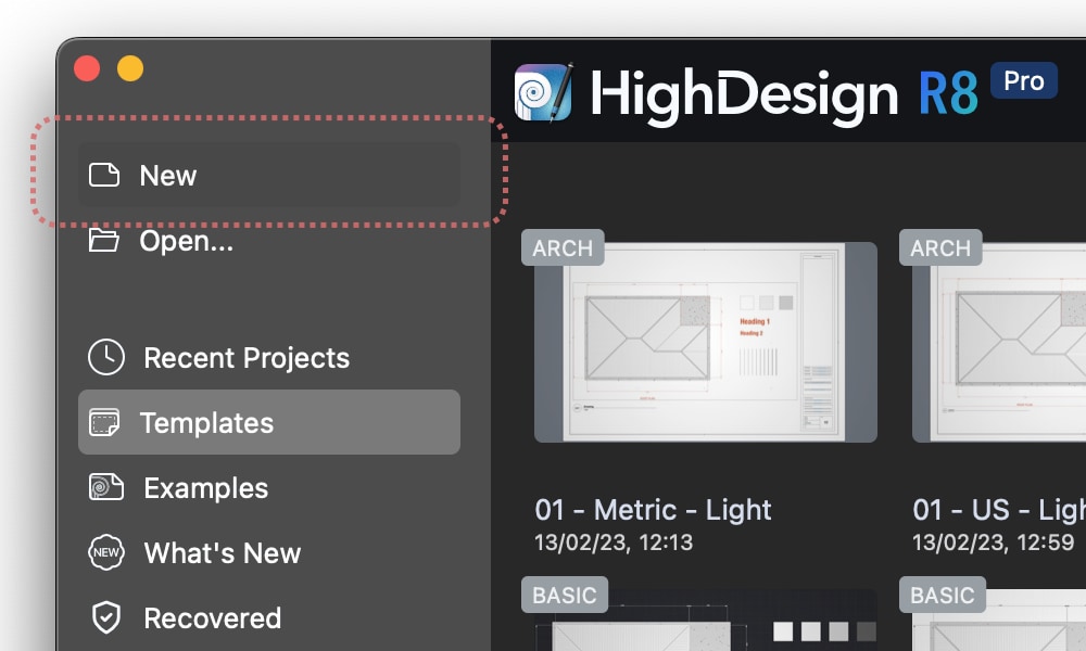
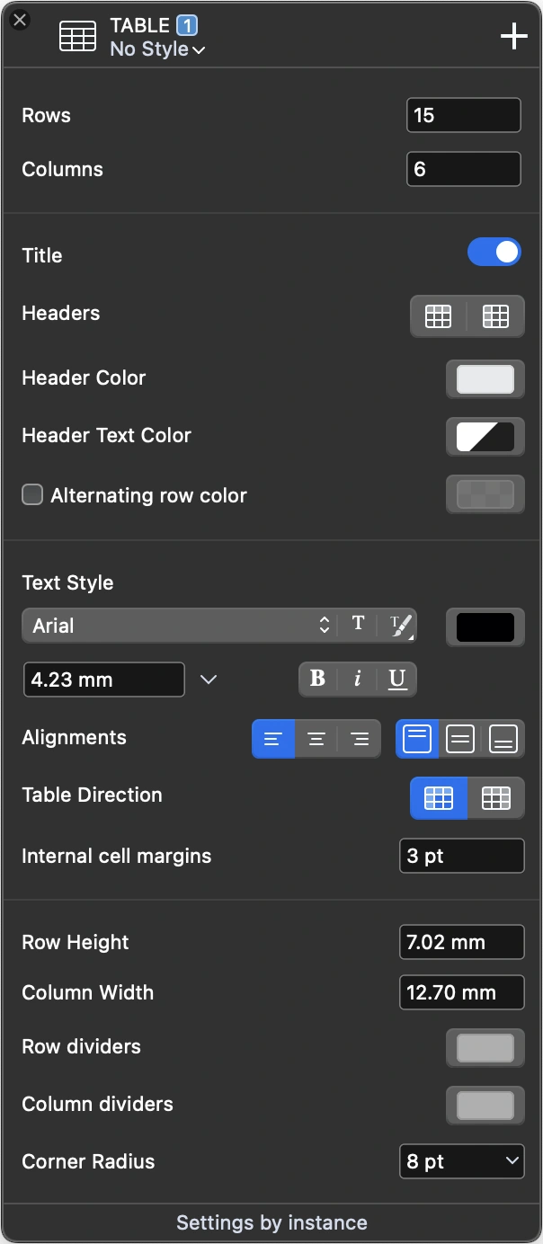
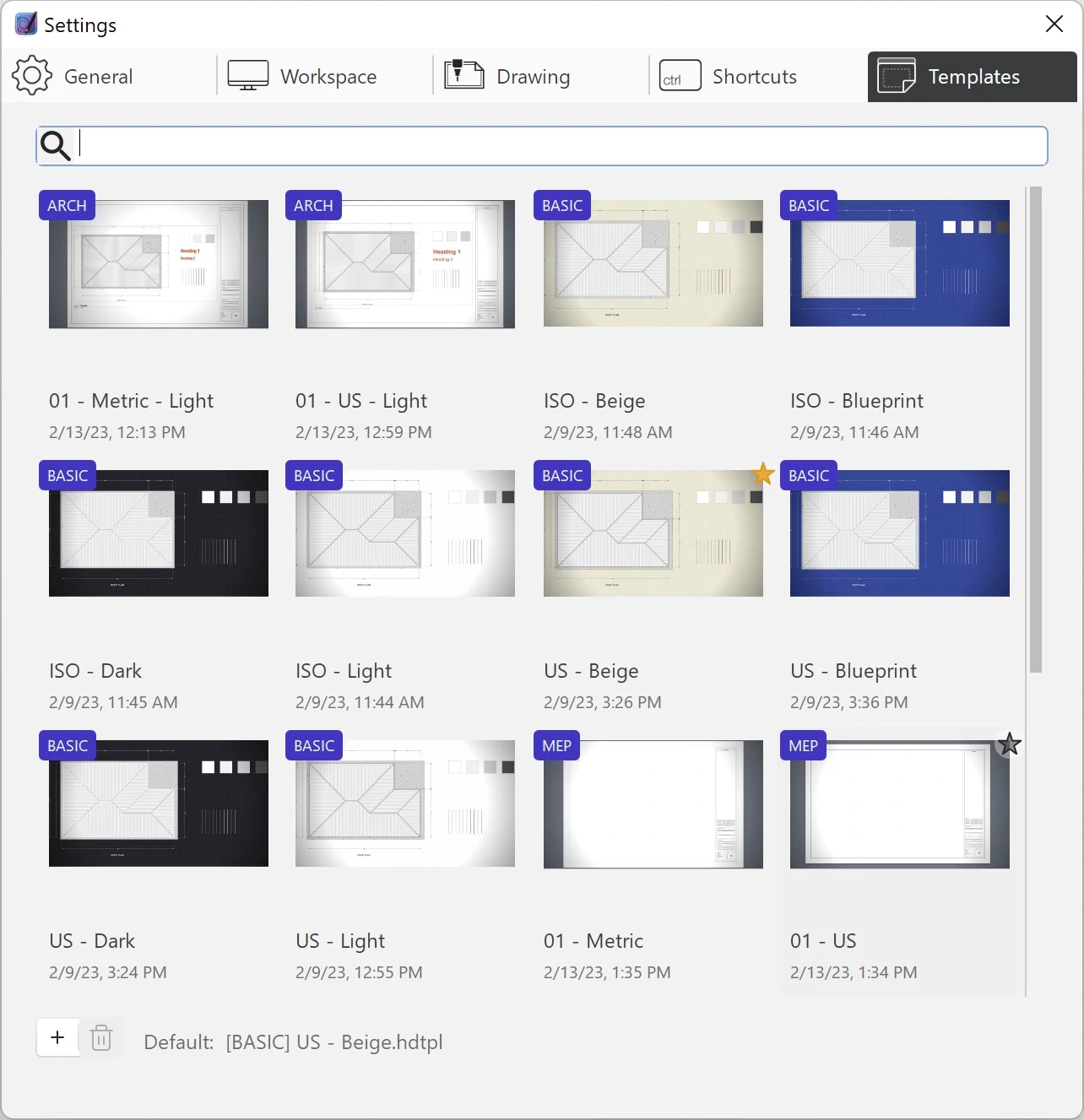
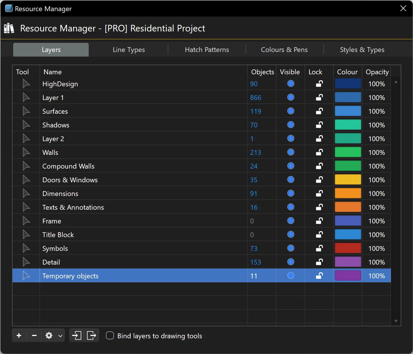
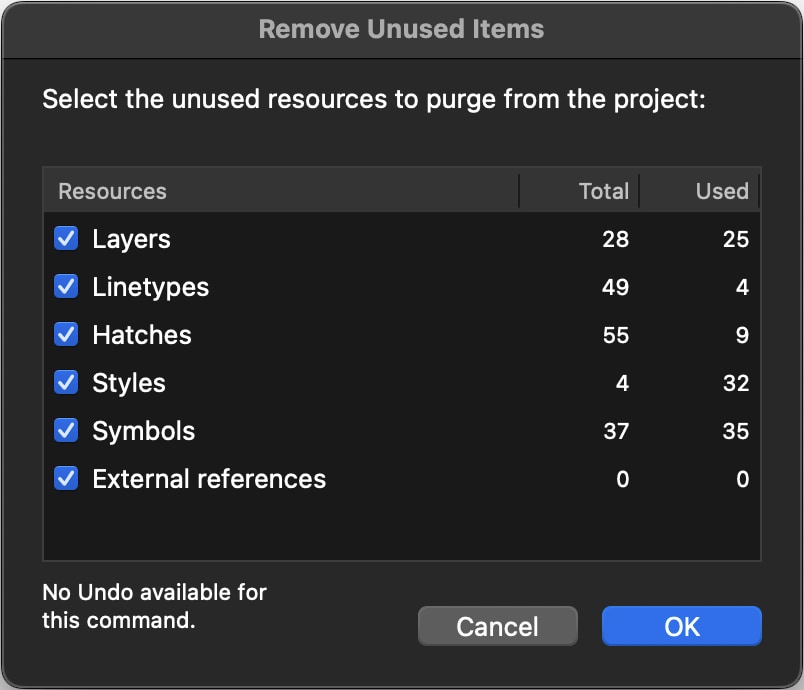
The Project Window
The main functions of HighDesign are visible and ready to use in the Project Window and in the surrounding toolbars and Sidebar.
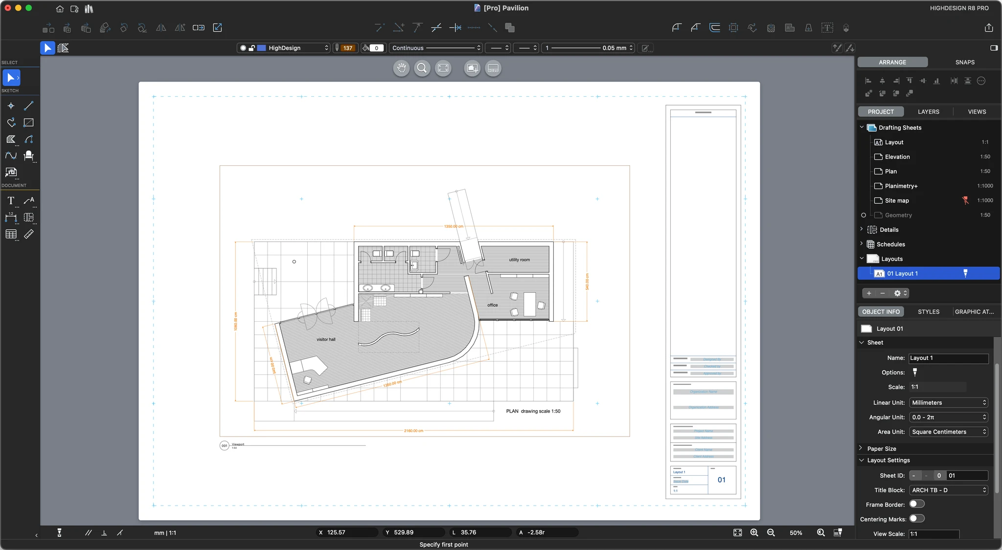
The project window as it appears on a new document._
- The Drawing Area in the middle of the project window displays the project views and the sheets used to draw and edit drafting objects and project elements.
- The toolbars provide essential functions, such as the drawing tools, the drawing methods, the input fields and commands, the edit functions, and the properties controls. Through these commands, arranged in logical areas, all the drawing functions are easily accessible.
- The Sidebar provides functions that are mainly used to organize the project and manage project elements: the Project Browser and the Views panels, the Object Info and the Project Styles panels.
- The Menu bar on the top of the project window displays the menus listing almost all of the program functions, commands and features.
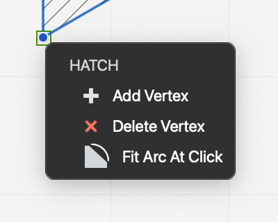
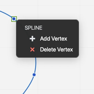
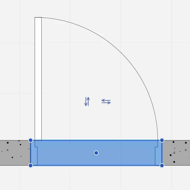
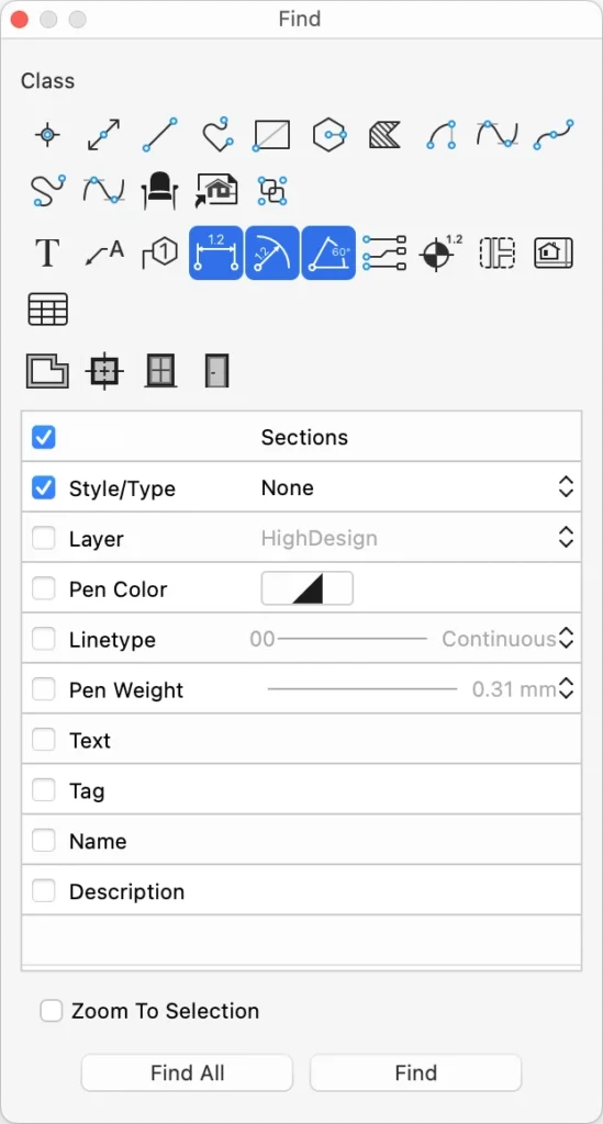
- Selection: select project elements by direct click or by selection area; modify selected elements
- Sketch: create and modify 2D drawing elements.
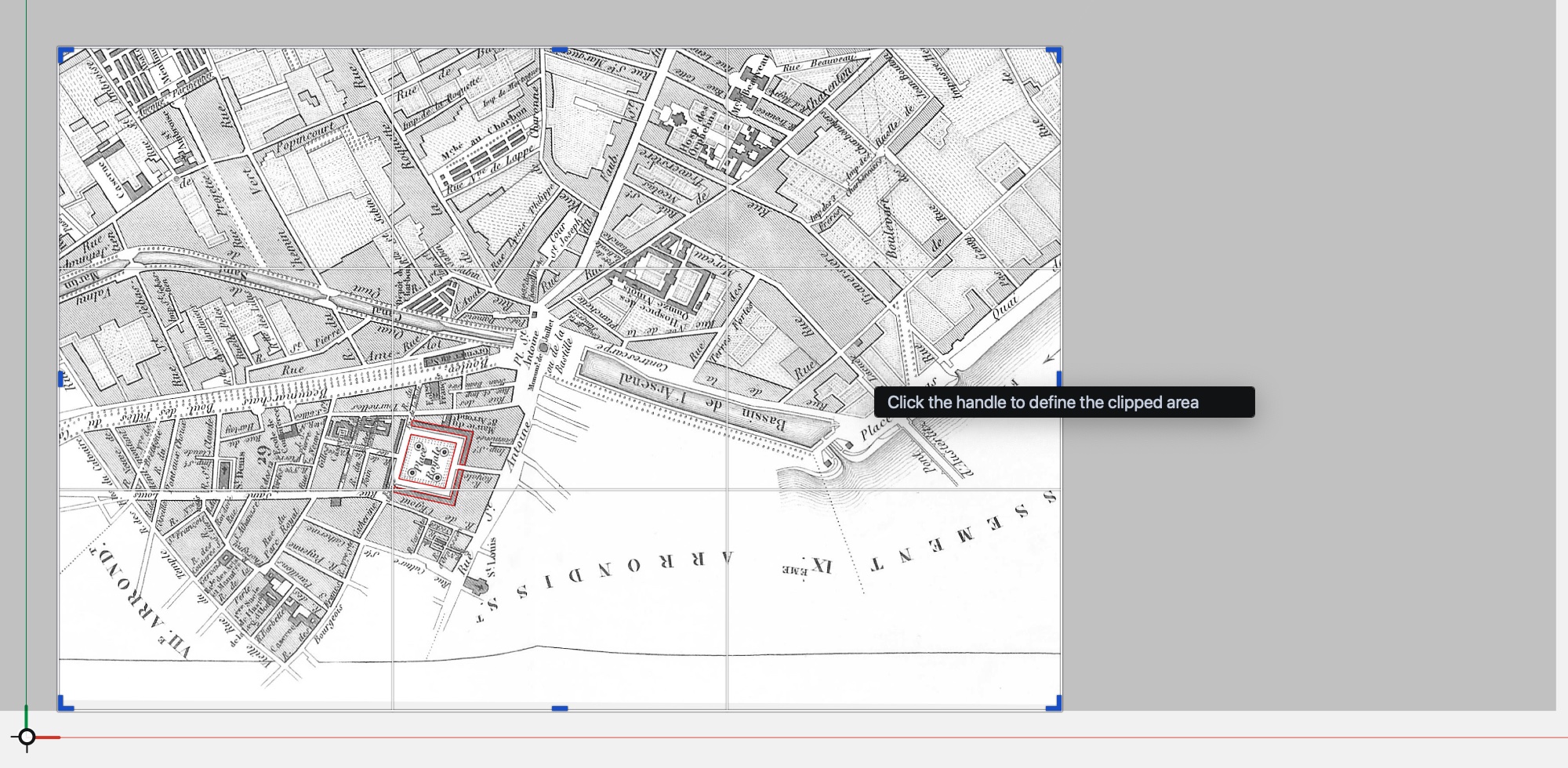
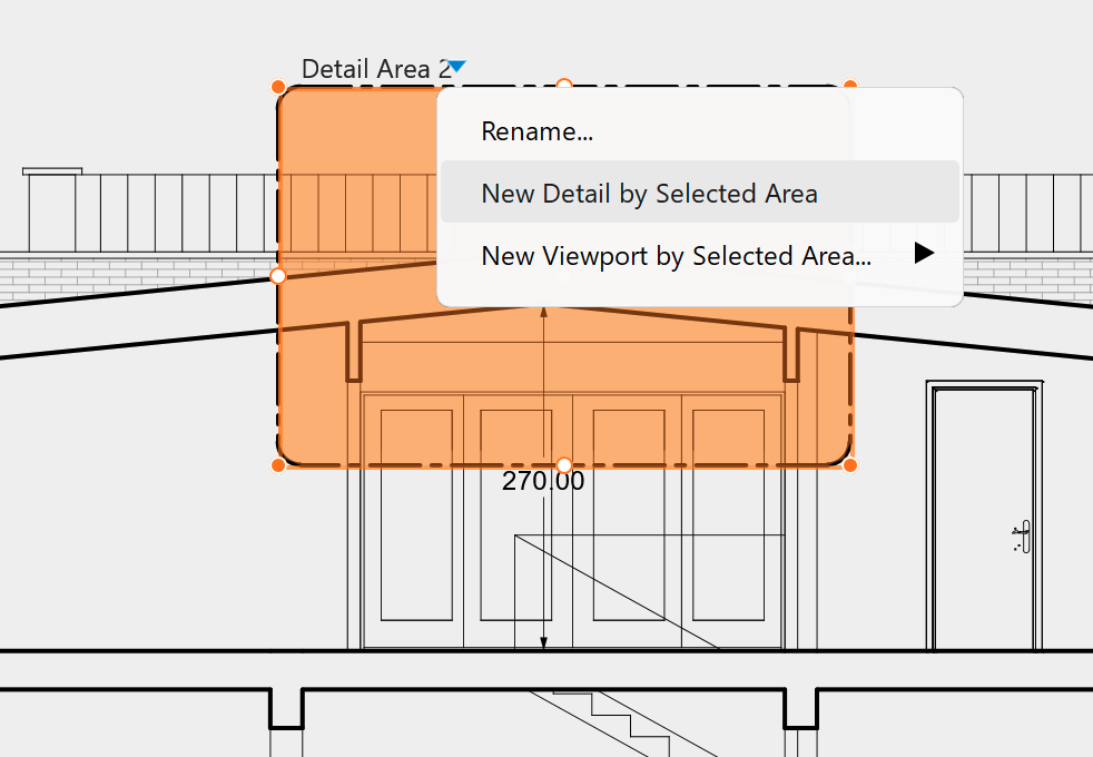
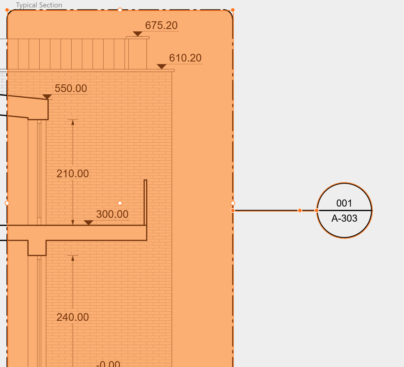
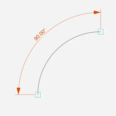
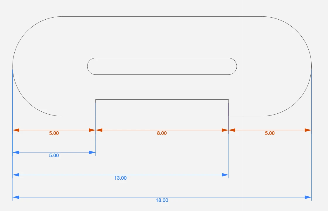
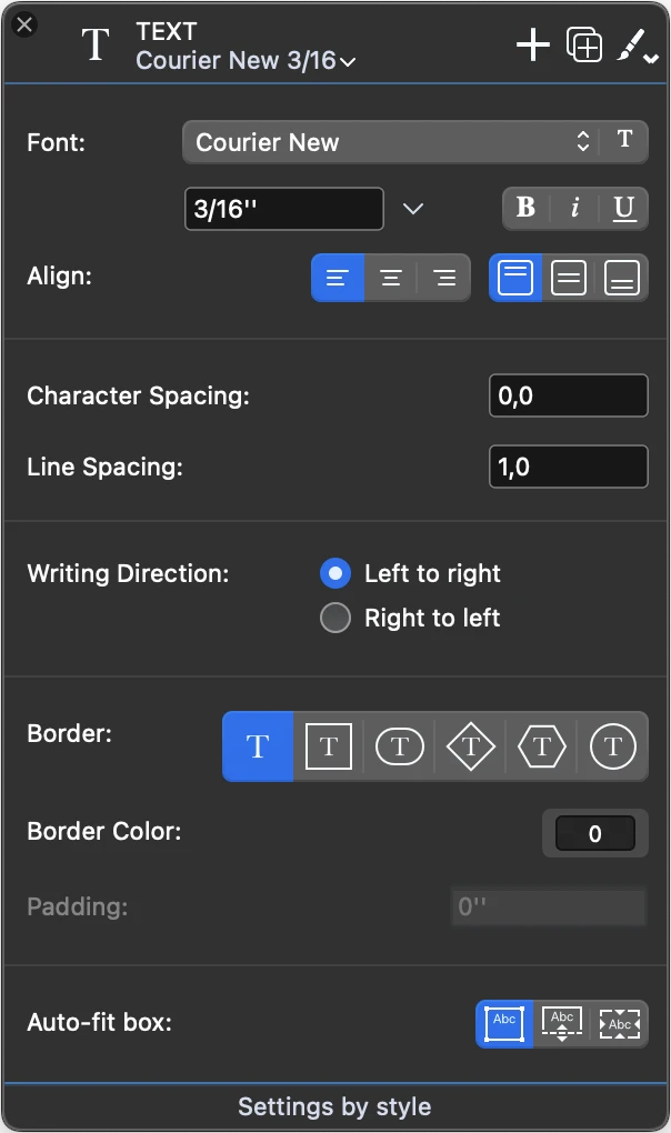
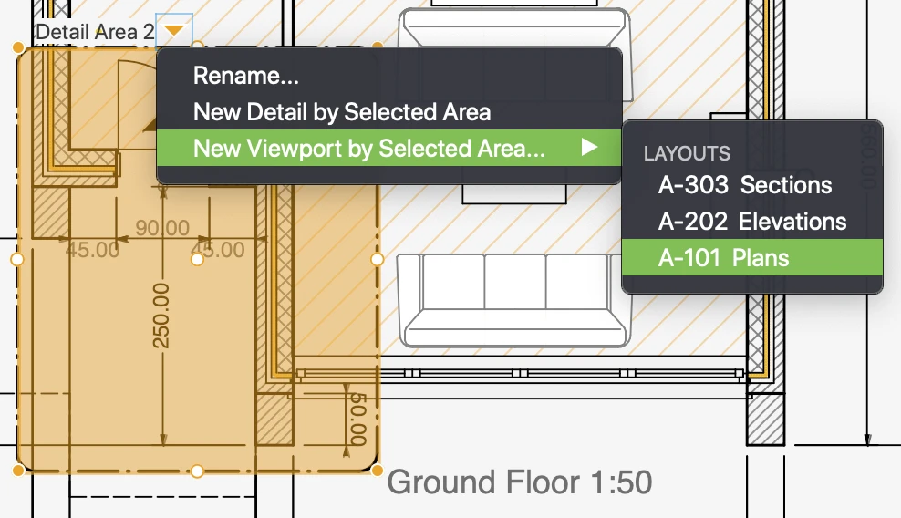
- Documentation: insert and modify texts, dimensions, text notes, tags, and define detail areas (standard/pro) and add temporary measurements.
- Design: create and modify architectural elements like walls, openings, columns (Pro).
- View: change the position of the drawing in the canvas via the panning function, the level of zoom; by preferences these tools can also be grouped in a dock and displayed on one side of the drawing area.
Main Toolbar
Placed on the top margin of the drawing area, the main toolbar bar lets you quickly access the most common functions used to modify the drawing with just one click on the icon. The buttons are contextually enabled when the conditions for the use of the tool are met, like number and type of selected items.
Note that this toolbar does not show all the available functions, but only the most commonly accessed. More functions and commands are available on the Drawing and Tools menus.
_
Main Toolbar
Placed on the top margin of the drawing area, the main toolbar bar lets you quickly access the most common functions used to modify the drawing with just one click on the icon. The buttons are contextually enabled when the conditions for the use of the tool are met, like number and type of selected items.
Note that this toolbar does not show all the available functions, but only the most commonly accessed. More functions and commands are available on the Drawing and Tools menus.
 _
_
- Move
- Duplicate
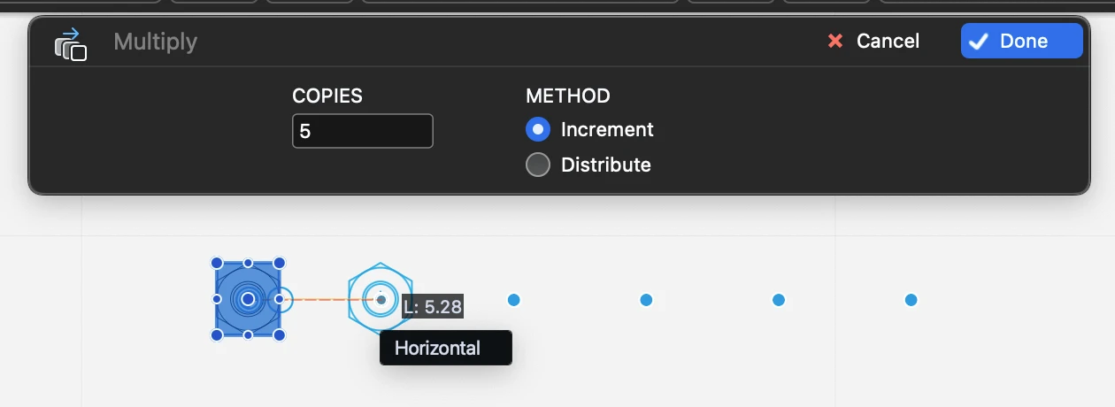
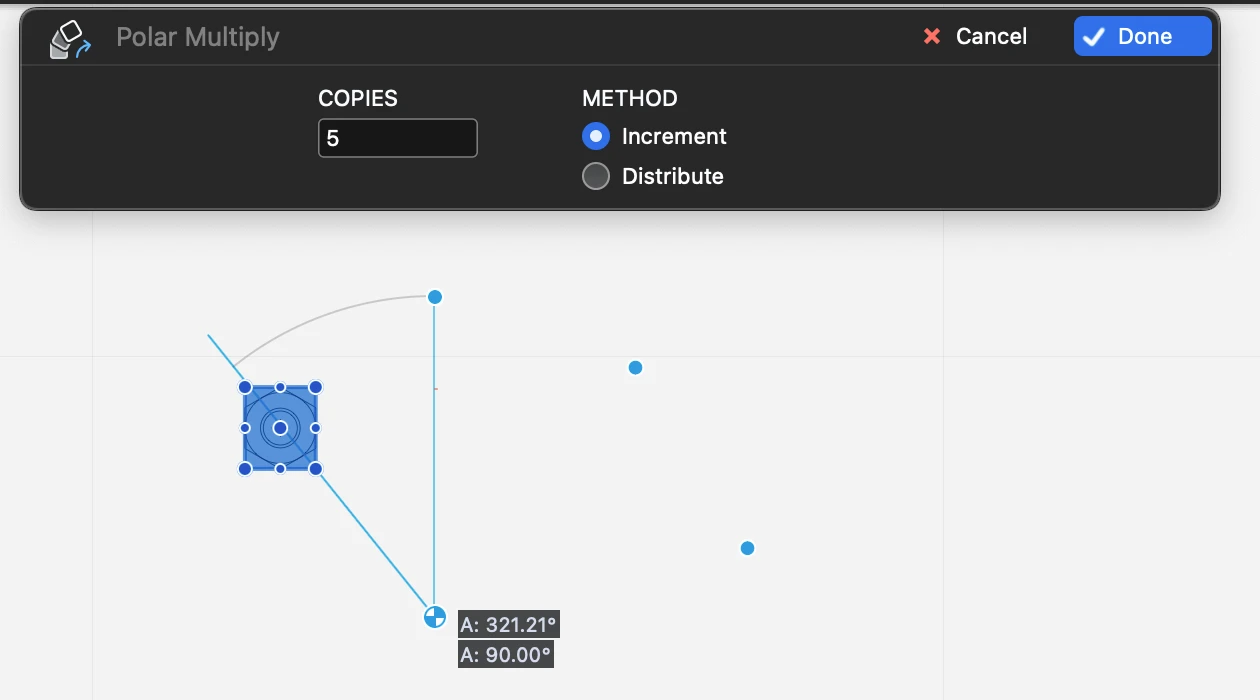
- Multiply / Distribute items along a line
- Multiply / Distribute items on a circular arc
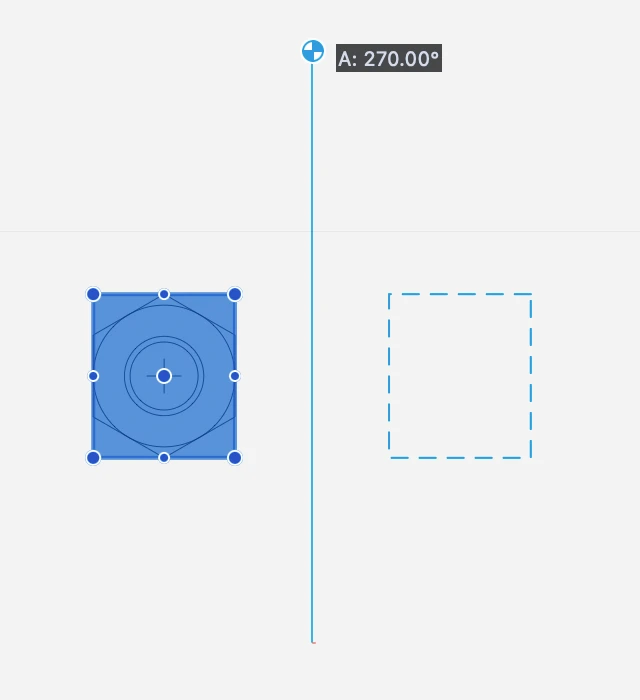
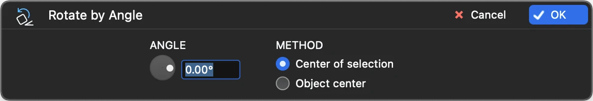
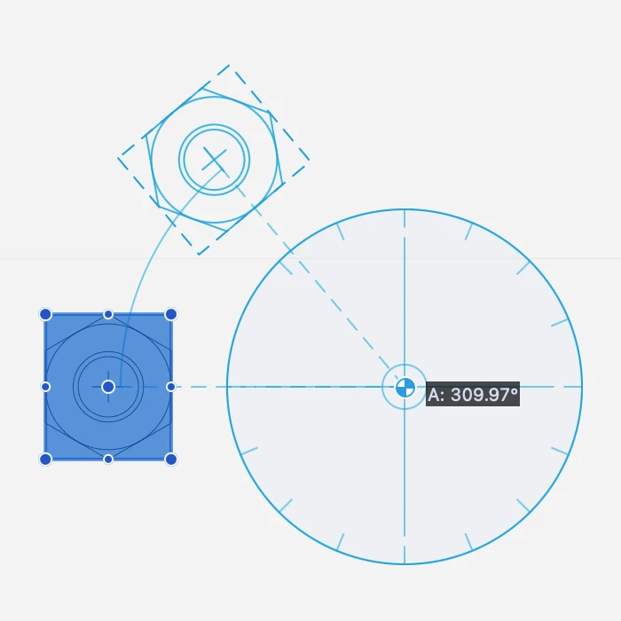
- Rotate
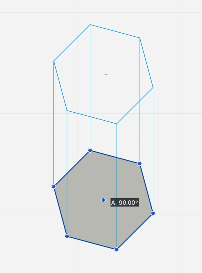
- Angle of Rotation
- Mirror
- Mirror & Duplicate
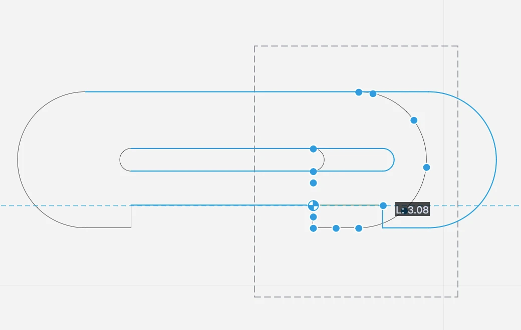
- Stretch
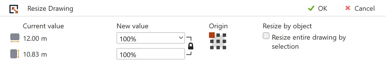
- Scale drawing
Object Editing:
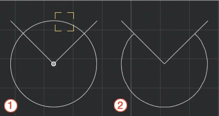
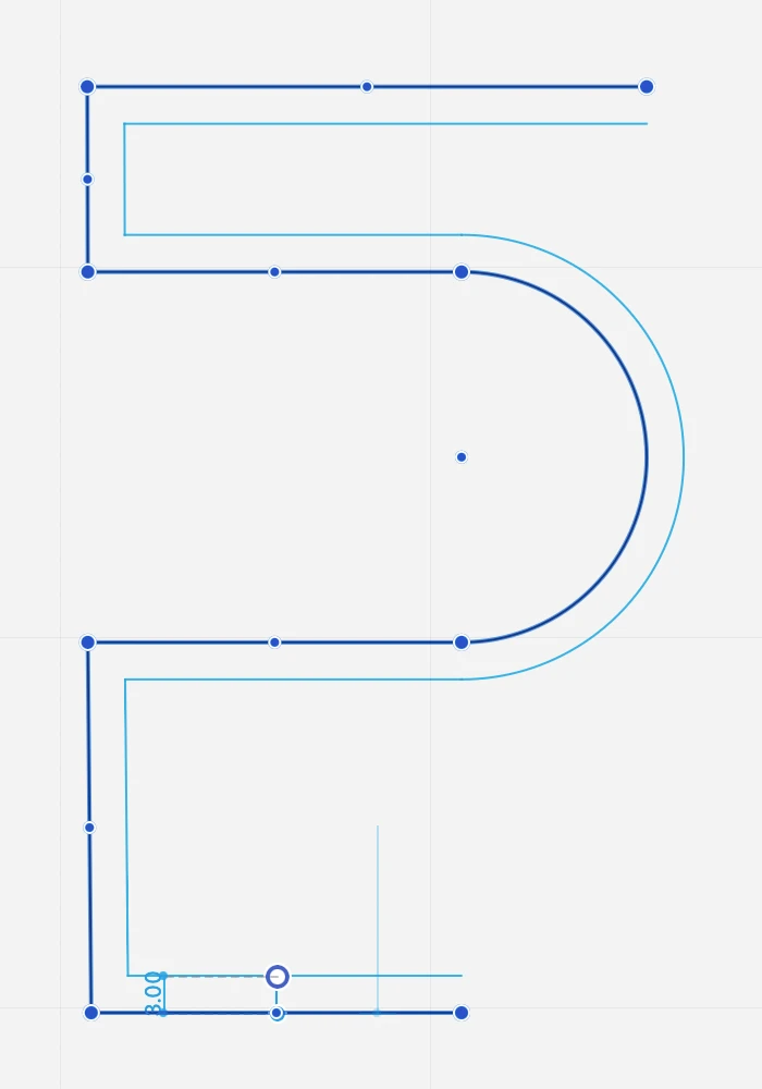
- Fillet two lines with an arc
- Chamfer two lines with a straight segment
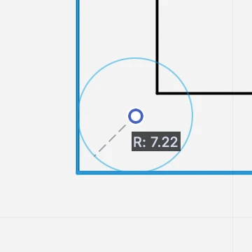
- Offset, to create concentric copies of the clicked objects at a given distance
- Extrude, to create a copy of the selected objects with projection lines
- Explode, to convert the selected items into their base components
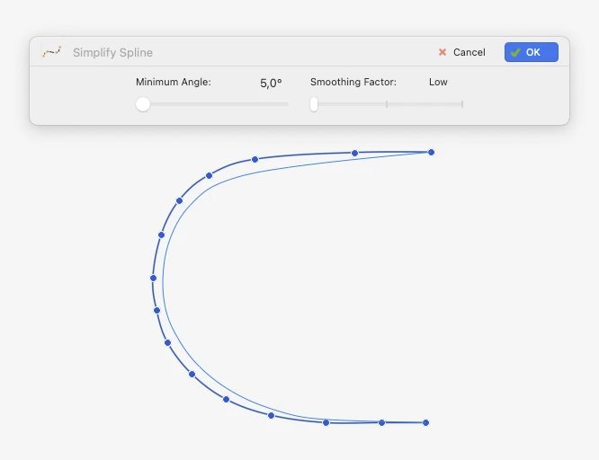
- Convert to Poly-line
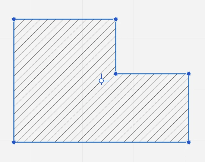
- Apply Hatch
- Calculate Area
- Find Center of Mass
- Fit Text box
Methods Bar
The Methods Bar displays the construction methods and available options of the current tool, e.g. Line from one endpoint or from its midpoint, or arc by center, by diameter, by three points, etc. This bar is contextual and changes its contents according to the selected project tool and can include an additional input field to quickly insert a parameter value.
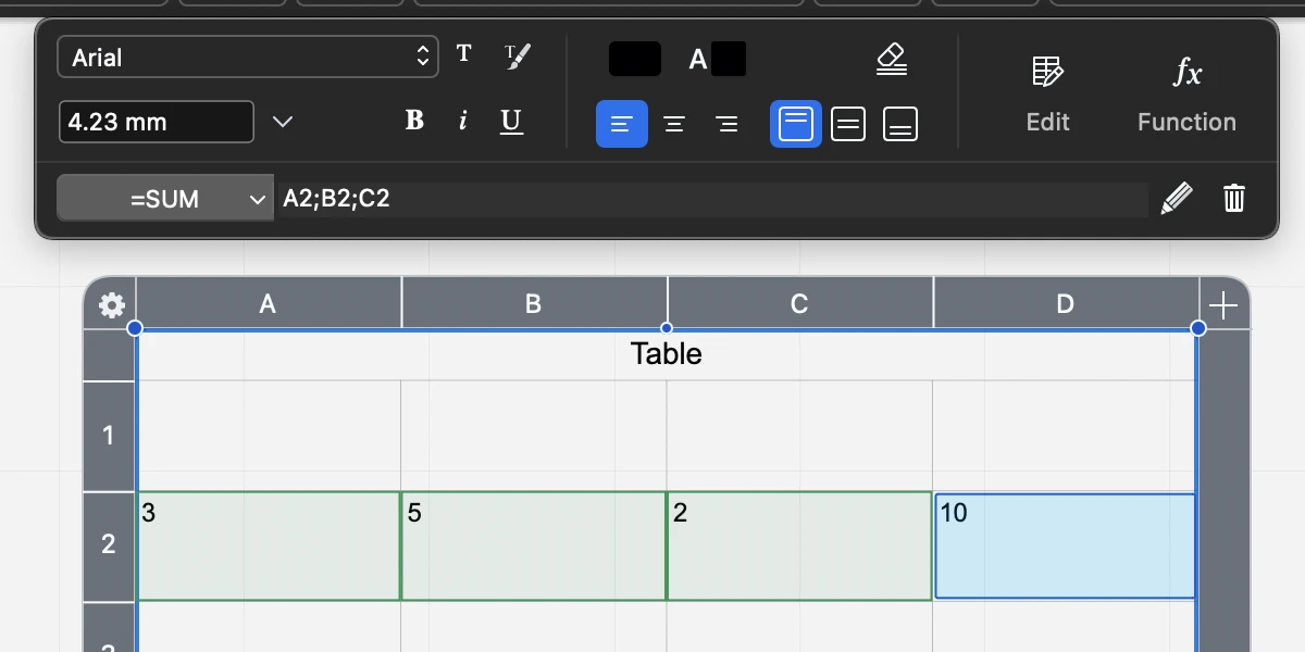
Properties Bar
The Properties bar is located at the top of the main window, just above the horizontal ruler and below the Edit Bar. You can use it to quickly set the graphical properties of the drawing items and change those of the selected one.
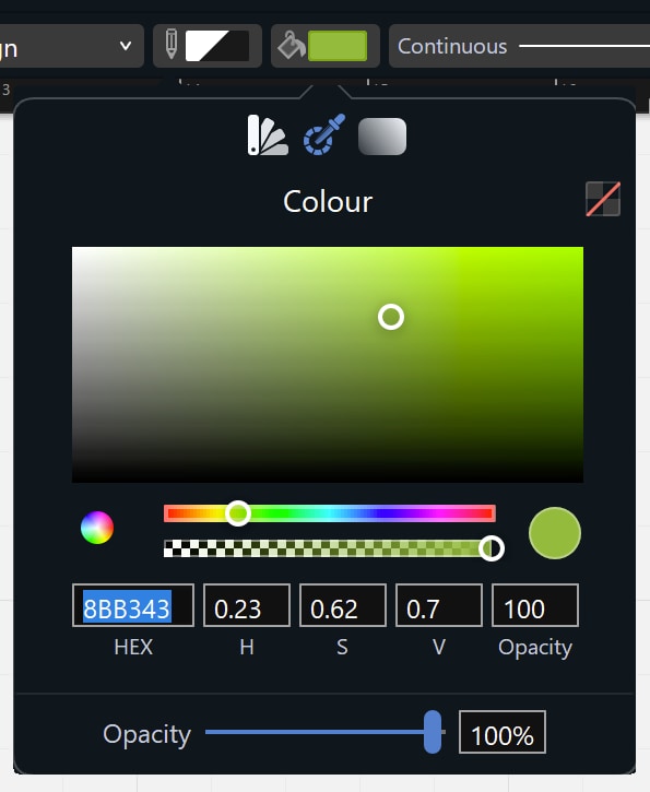
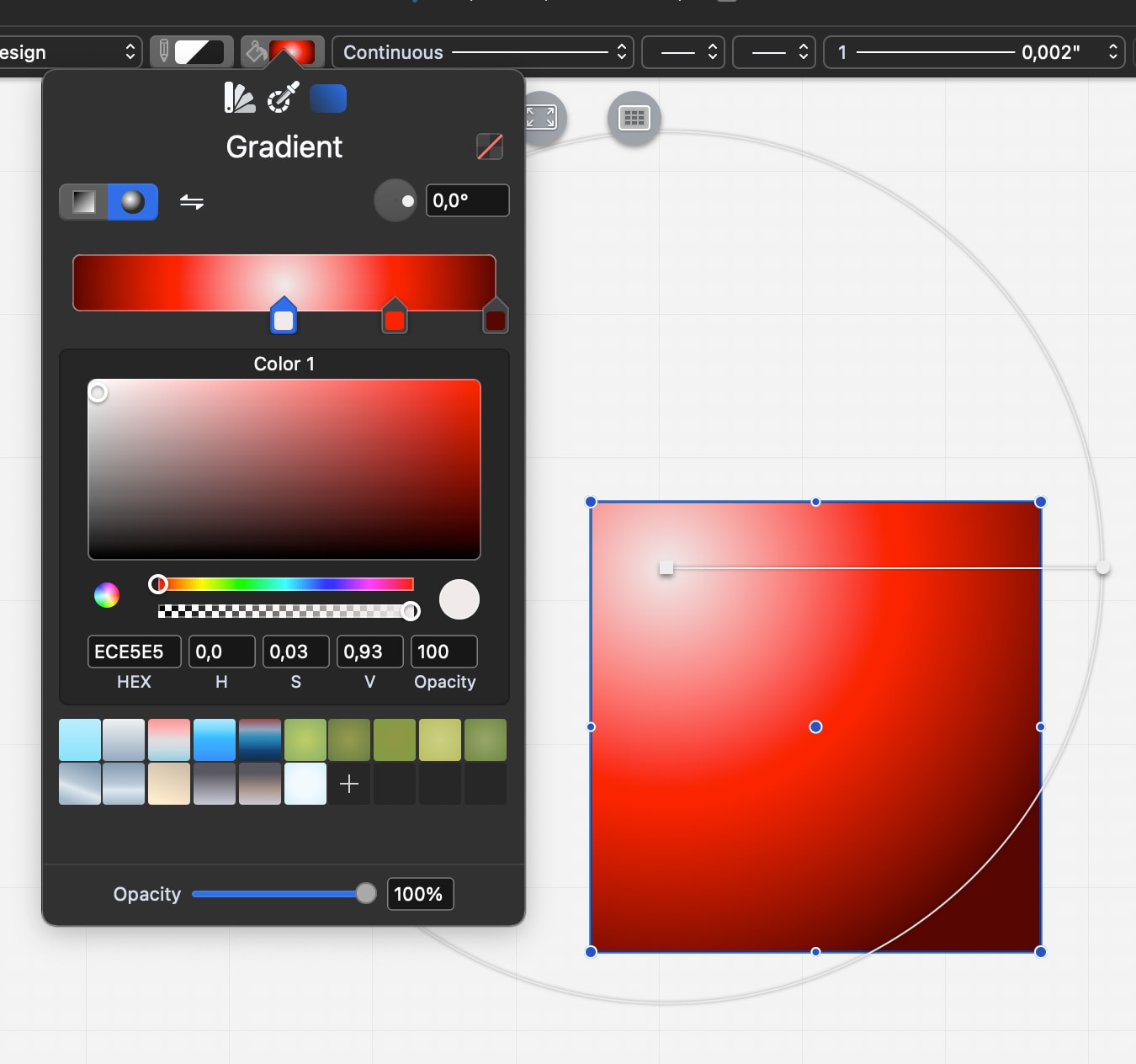
From left to right: Layer; Pen color; Fill color, gradient and transparency; Line-type; Start and end markers; Pen weight; Settings Window button (active when compatible items are selected); Copy and Paste Properties buttons.
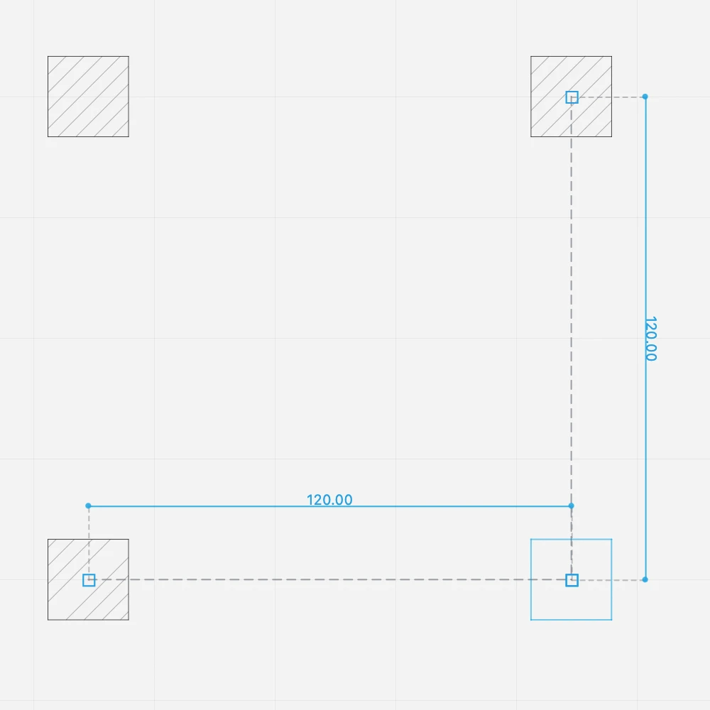
Placed on the bottom of the drawing area the Input Bar provides all the controls to set the drawing constraints, geometric conditions and input of coordinates, lengths and angles.
From left to right:
- The menu to activate the snap options.
- The buttons to set the parallel, orthogonal and intersection constraints.
- The menu to change the drawing units and the drawing scale of the current sheet.
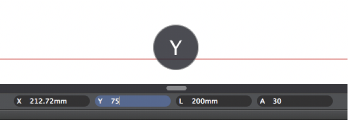
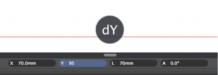
- Input fields: X, Y coordinates, length and angle. When drawing an item, the coordinates change from absolute to relative coordinates dX and dY. You can switch between absolute and relative coordinates by clicking the X and Y icons.
- The utility buttons and menus, to set the zoom level and the display mode of pen weights.
NOTE: Depending on the available screen size, the appearance and contents of the Input bar can change. At smaller resolutions, the Snaps menu includes the constraint functions, and the zoom menu includes the Zoom to Fit, Zoom In, Zoom Out and Zoom Previous commands. The input fields are always visible.
Side Bar and Utility Panels
**Customize the Side Bar **(Pro)
In HighDesign Pro the Side bar can be customized by using the commands on the Window menu:
- Minimize Side Bar
- Panels:
- Show as Floating Windows;
- Show in Side Bar;
- Restore Defaults;
- List of all available panels or floating windows.
Panes of the Side Bar and Utility panels
By default in HighDesign Pro the panes displayed in the Side Bar are Project Browser, Project Views, Object Info and Project Styles and Types. With other editions of HighDesign the configuration of the Side Bar is different.
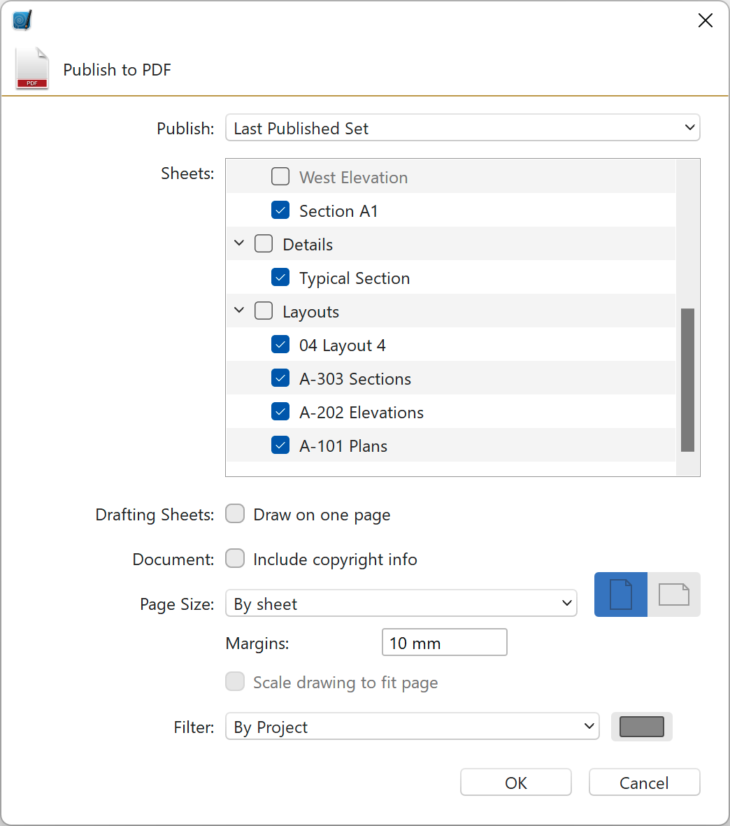
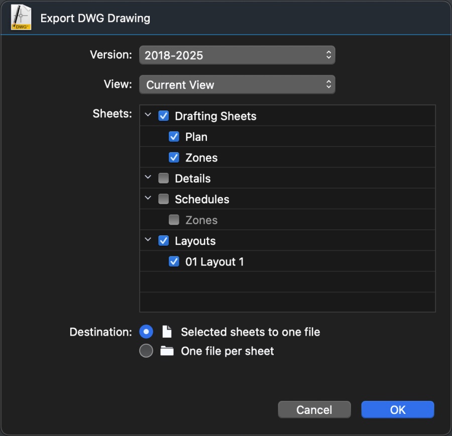
Project Browser (SE-Pro)
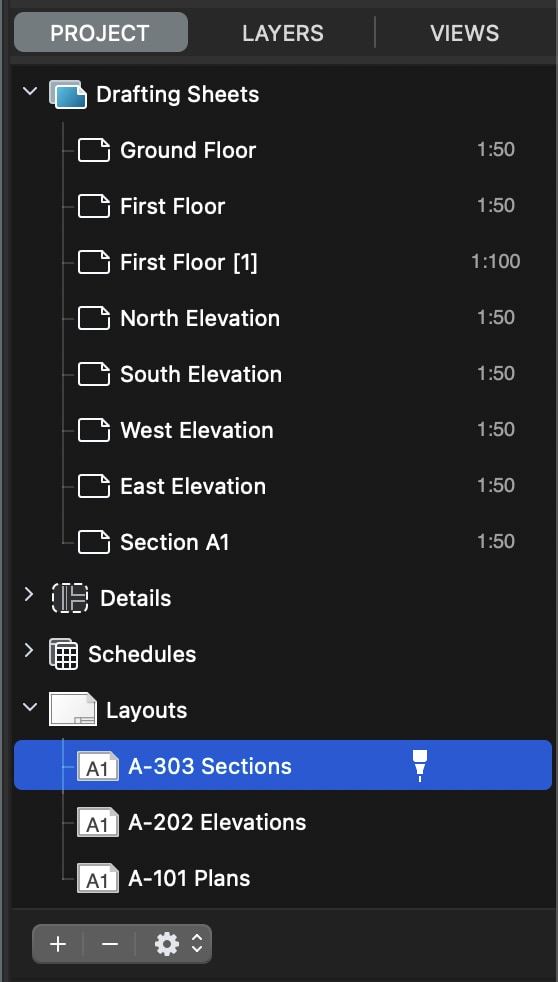
The Project Browser pane lists all the project sheets: drafting sheets, detail sheets and layouts.
Use this pane to manage and organize sheets and to browse the different components of the project. This pane is not available in HighDesign LT.
Project Views (SE-Pro)
The Views pane shows a list of all the saved project views (available in HighDesign Pro only).
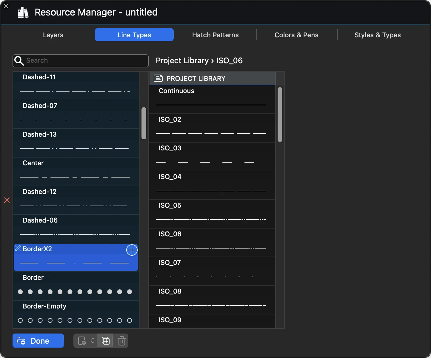
Layers
The Layers pane shows the layers used in the project and provides the functions to manage them.
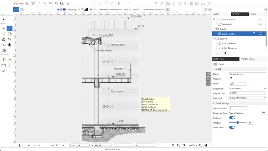
Object Info
The Object Info pane allows to view and edit coordinates and geometric parameters of the selection. It also allows the setup of the current sheet and to add information.
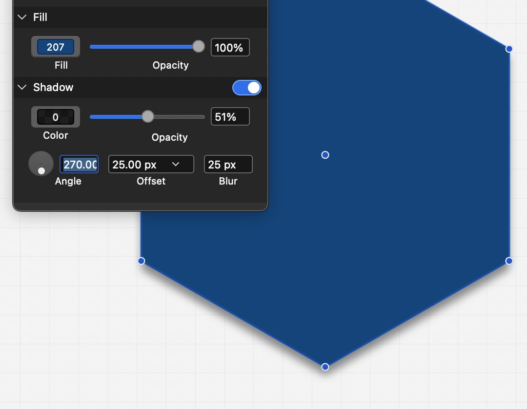
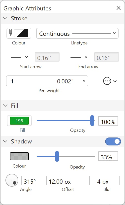
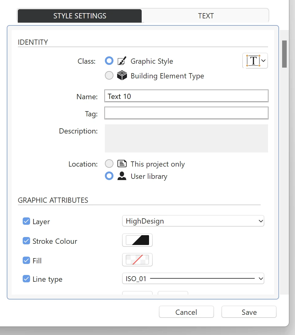
Graphic Attributes
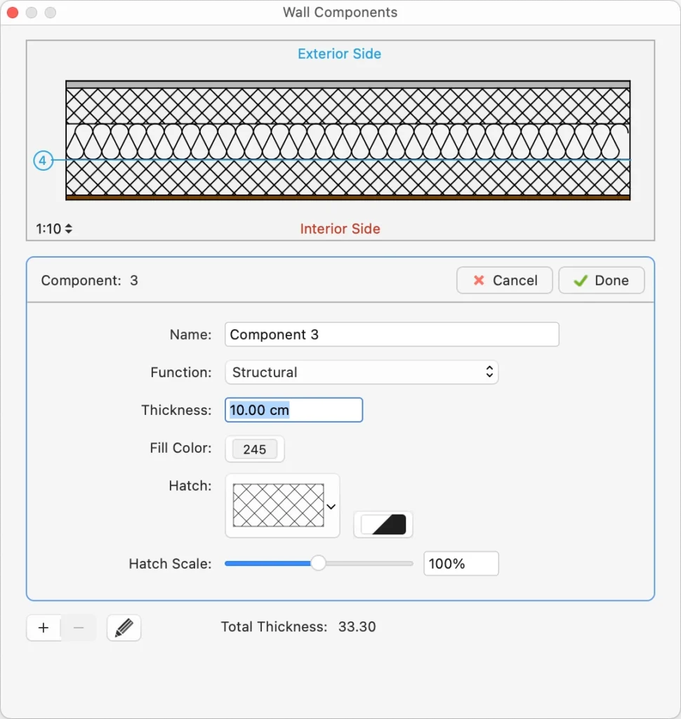
This pane provides in one handy array the graphic features of project elements, including stroke and fill attributes: it also provides the Shadow section for a complete setup of the shadow property of elements.
Overview/Zoom
The Overview utility pane displays a real-time 2x magnification of the sector of the current pointer location on the drawing area; if the mouse pointer enters the thumbnail, an overview of the entire drawing is displayed and it is possible to centre the view of the project with a click.
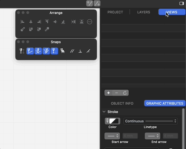
Snaps
This pane provides all the snap options and the main drawing constraints.
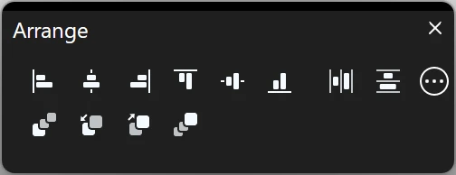
Arrange
The Arrange panel displays the buttons for all the Arrange Order, Align and Distribute objects commands.
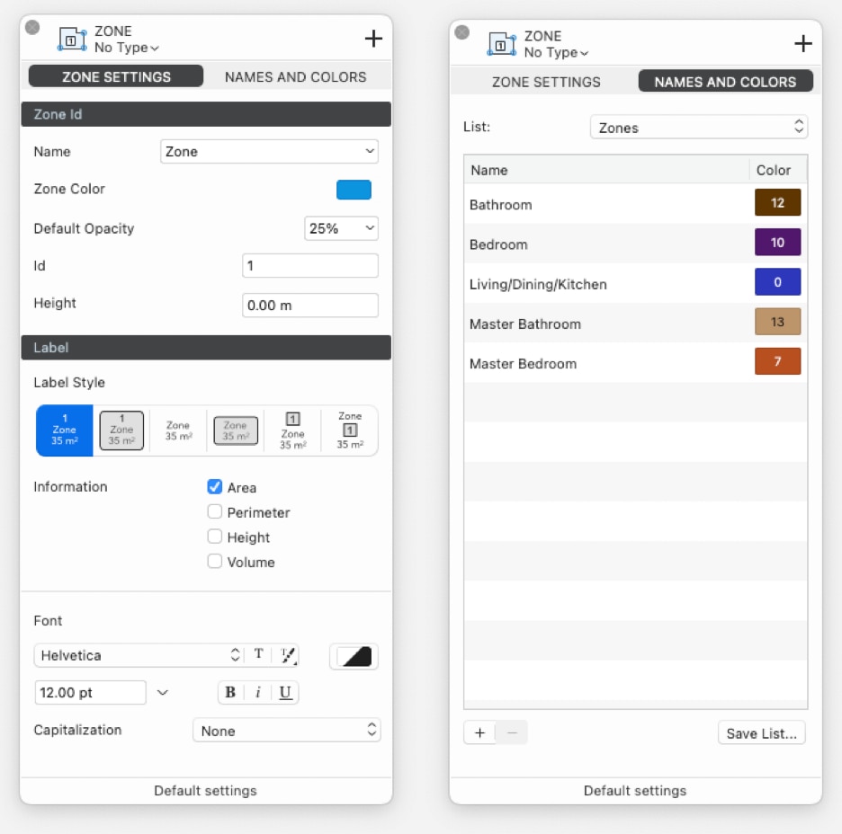
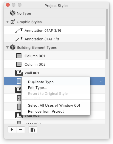
Project Styles and Types (Pro)
In HighDesign Pro use this pane to view, browse and manage graphic styles and element types of the current project.
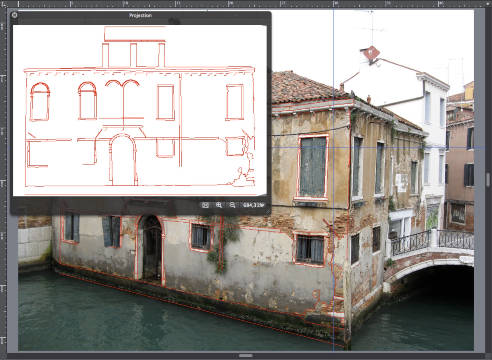
Photogrammetry Preview (Pro)
This is a live preview of the projection of the current photogrammetry (Pro only).
Rulers
Placed on the left and top of the main window, rulers help drawing and placing objects in a layout with accuracy. Rulers show the current position of the pointer and the bounds of the selected objects and are dynamically linked to the current measurement unit, drawing scale and zoom factor.
Panes of the Side Bar and Utility panels
By default in HighDesign Pro the panes displayed in the Side Bar are Project Browser, Project Views, Object Info and Project Styles and Types. With other editions of HighDesign the configuration of the Side Bar is different.
Project Browser (SE-Pro)
The Project Browser pane lists all the project sheets: drafting sheets, detail sheets and layouts.
Use this pane to manage and organize sheets and to browse the different components of the project. This pane is not available in HighDesign LT.
Project Views (SE-Pro)
The Views pane shows a list of all the saved project views (available in HighDesign Pro only).
Layers
The Layers pane shows the layers used in the project and provides the functions to manage them.
Object Info
The Object Info pane allows to view and edit coordinates and geometric parameters of the selection. It also allows the setup of the current sheet and to add information.
Graphic Attributes
This pane provides in one handy array the graphic features of project elements, including stroke and fill attributes: it also provides the Shadow section for a complete setup of the shadow property of elements.
Overview/Zoom
The Overview utility pane displays a real-time 2x magnification of the sector of the current pointer location on the drawing area; if the mouse pointer enters the thumbnail, an overview of the entire drawing is displayed and it is possible to centre the view of the project with a click.
Snaps
This pane provides all the snap options and the main drawing constraints.
Arrange
The Arrange panel displays the buttons for all the Arrange Order, Align and Distribute objects commands.
Project Styles and Types (Pro)
In HighDesign Pro use this pane to view, browse and manage graphic styles and element types of the current project.
Photogrammetry Preview (Pro)
This is a live preview of the projection of the current photogrammetry (Pro only).
Rulers
Placed on the left and top of the main window, rulers help drawing and placing objects in a layout with accuracy. Rulers show the current position of the pointer and the bounds of the selected objects and are dynamically linked to the current measurement unit, drawing scale and zoom factor.
- The button located on the top-right hand corner between the two rulers lets you place the new origin: click it, move the orthogonal guides appearing on screen and click to set the new location.
- On the right end of the top horizontal ruler, a button opens a pop-up menu which lets you select a new measurement unit or open the “Units” pane of the Preferences window.
- You can add a horizontal or vertical guide by clicking on a ruler and dragging the pointer on the drawing area.
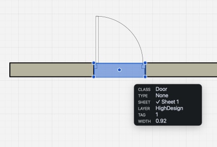
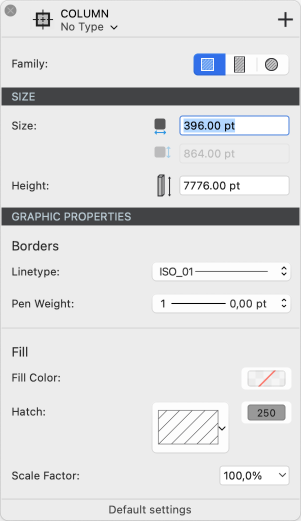
The Object Info Panel
The Object Info panel provides easy access to coordinates and other geometric parameters, as well as textual information on selected objects. If no graphic object is selected, the Object Info panel provides all information relating to the current sheet.
This panel lets you read and edit the coordinates of any of the object’s control points: width, height, length, angle, etc.
_
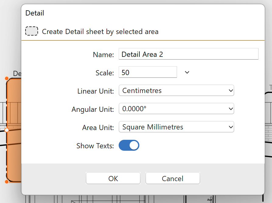
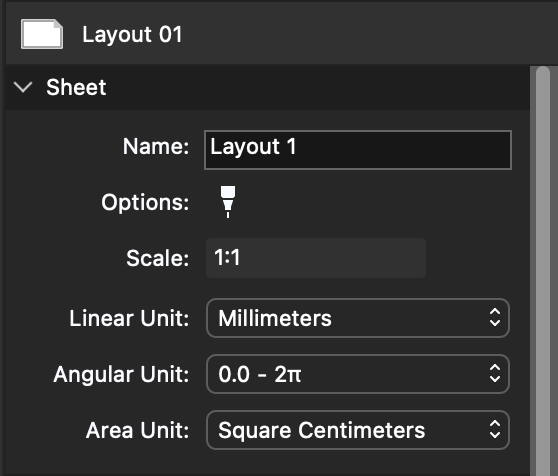
The Object Info panel is the main interface for configuring the current sheet, detail or layout: the various sections of the panel provide all the controls and fields needed to define name, scale, units, page size, graphic options and other information.
Info Object panel sections
The panel is organized into distinct sections that group together affine data and vary according to the item displayed:
Sheet :
When no object is selected, object information displays information on the current sheet.
_
- Header : sheet class
- Sheet : name, options, scale and units
- Paper size : visible for sheets that support one paper size.
- Class-specific settings
Object of the project :
The header section of the panel displays the icon and class of the current element.
The header section of the panel displays the icon and class of the current element.
- When you select one or more objects in the drawing, Object Info immediately displays all the numerical properties of the last object selected. The icon and name of the current object are displayed in the top bar of the window, as are the back and forward arrows used to scroll through the objects in the selection. ;
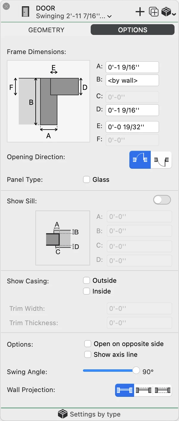
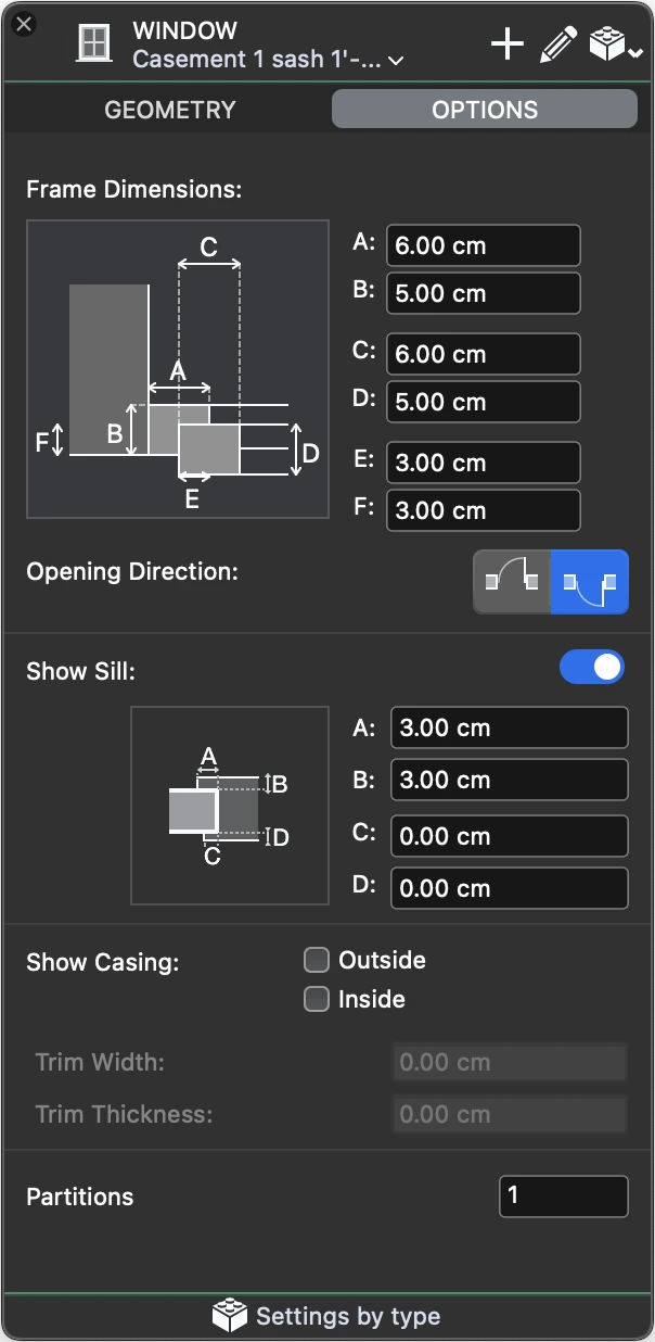
- Some objects, such as symbols, texts, dimensions or walls, have special parameters which are not displayed in the Object Info panel: when one of these objects is selected, its parameter window can be opened by clicking on the icon in the top bar of the Object Info panel, or by clicking on the Show parameters button in the ID section;
By default, Object Info modifies all selected objects of the same type. To modify only the current object, whose values are displayed on the panel, open the header context menu and choose “Apply only to current object”. This option remains selected until it is changed again.
For multiple selections, use the Previous and Next buttons on the right to activate the current object.
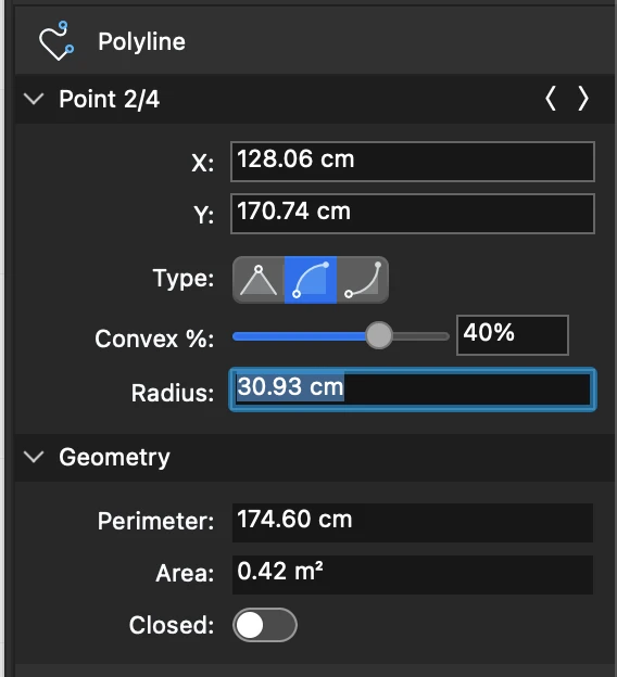
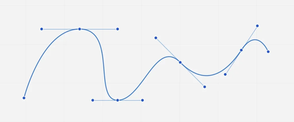
Point
The Point section displays the X, Y and Z coordinates of the current point. The current point is highlighted in the drawing, and you can use the “Previous” and “Next” buttons to scroll through the object’s handles. To modify a value, click on the field, insert the new value and press the Return key on the keyboard.
 _
_
- Depending on the type of object and the active point, the action resulting from editing the coordinates of the active point may be a stretch or a translation. For example, if you edit point 2 of a line, it is stretched; if you edit point 3 of a circle (its center), the action is a translation. ;
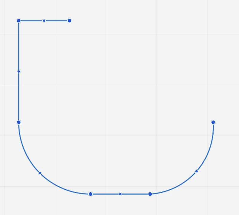
- When a rectangle or polygon is selected, this section indicates the type of transformation compatible with the current active point. With poly-lines, it is possible to modify the convexity of the segment described by the active point.
Geometry
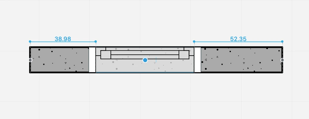
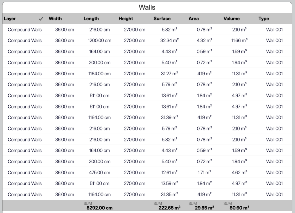
The Geometry section displays values describing the object’s size and orientation, such as width, height, radius, length, angle and so on. Fields such as width and height can be connected to constrain the object’s proportions.
This section also displays read-only values calculated on the basis of the current coordinates and size, such as perimeter and area.
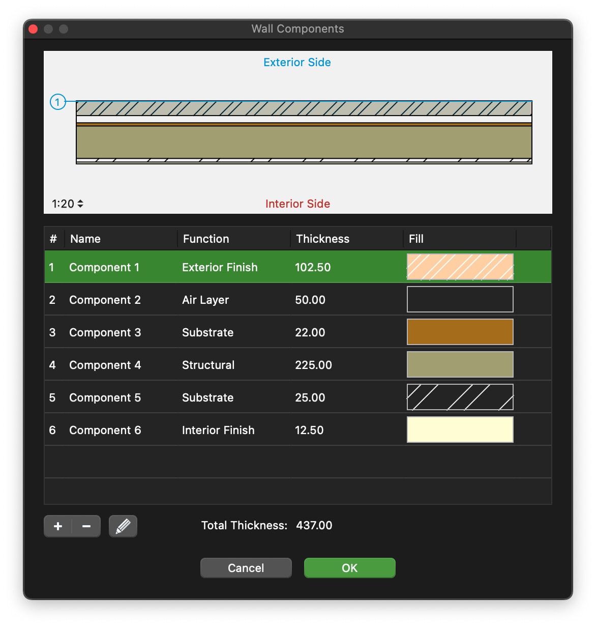
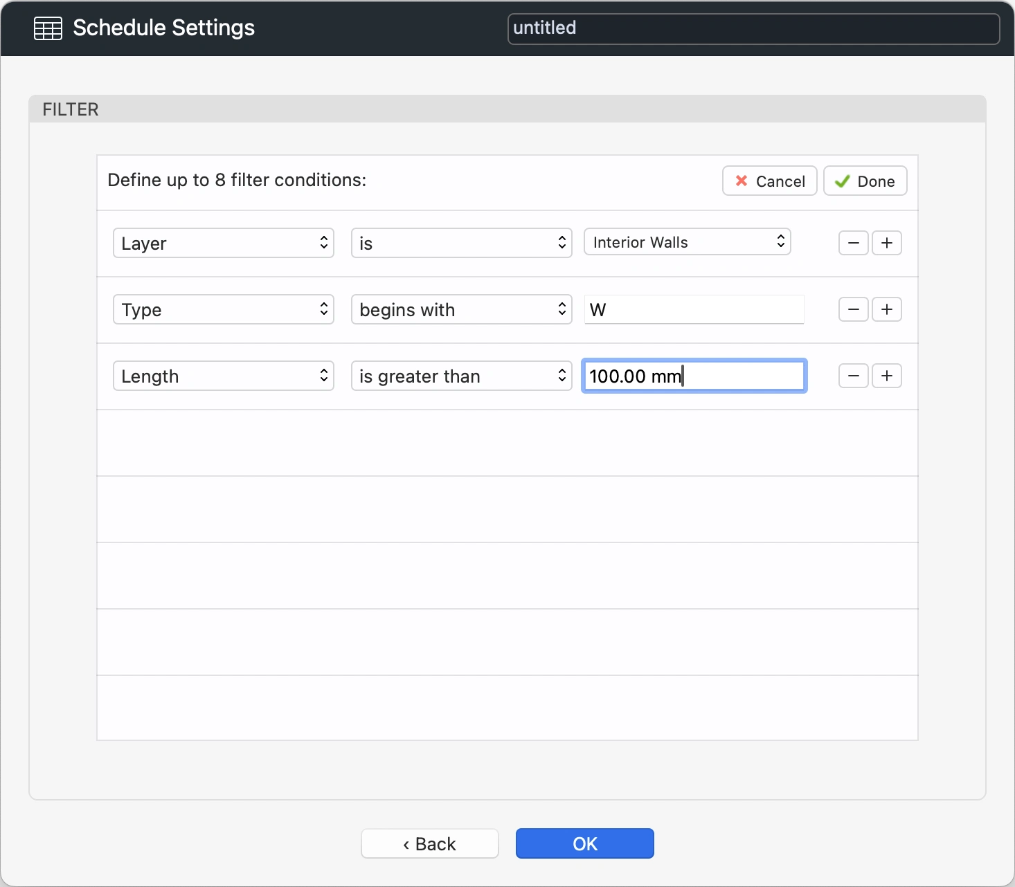
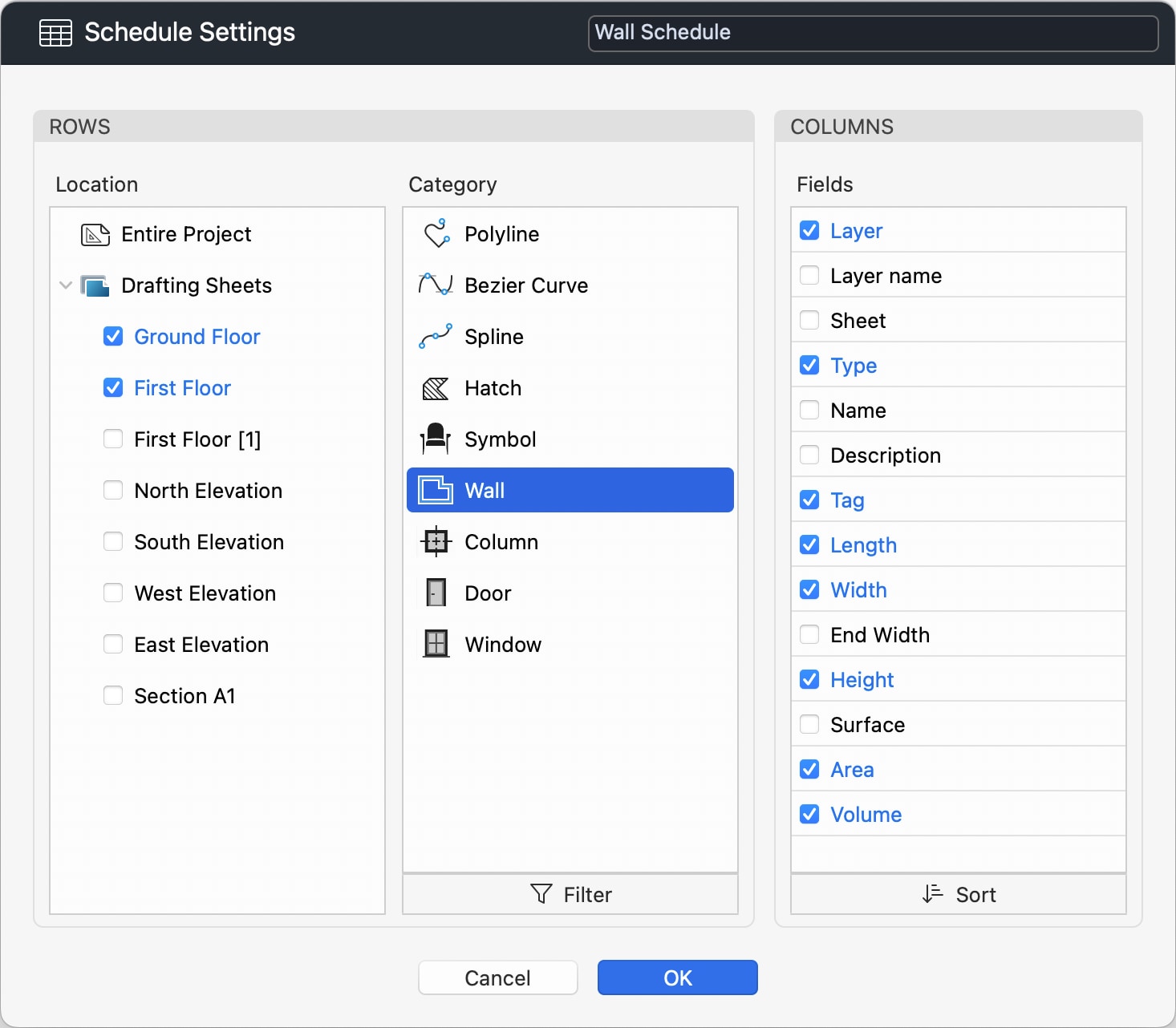
Some objects, such as dimensions and measurement paths, only display their value in a read-only field, as their size depends on other objects. Walls add controls that allow you to quickly modify the construction.
ID
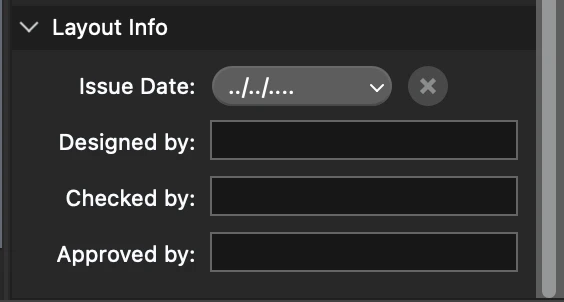
This section is specific to project elements with advanced properties (accessible via the Settings window) and shows the textual information associated with the object, such as name, description and identifier, which are used, for example, by annotation elements or title blocks.
This section also includes the button to open the parameters window for the selected object.