Subsections of Document and Present the Project
Dimensions
Subsections of Dimensions
About Dimensions
Use the Dimensions Tool to insert linear, multiple linear, radial, angular, ordinate and elevation dimensions. To set the dimension properties, either double-click the Dimensions tool in the Drawing Tools bar or choose Edit ▸ Settings Window ▸ Dimension to open the Dimension Settings dialog.
You can create a variety of dimensions for many different object classes. There are five dimension types:
- Linear, single and multiple, measure the linear distance between two points.
- Radial, that measure radius and diameter of arcs and circles.
- Angular measure the angle between to segments.
- Ordinate dimensions measure progressive distances or heights from a start point.
- Elevation dimensions mark a point at a given elevation.
Topics in this section
Angular Dimensions
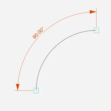
Angular dimensions measure the internal angle of an arc or the angle between two linear segments.
 _
_
To create an angular dimension
- Select the Angular dimension tool. Make sure the Associative option is selected if you want the dimension to automatically adjust to the measured object.
If you are measuring an arc:
If you are measuring an arc:
Dimension Tool Settings
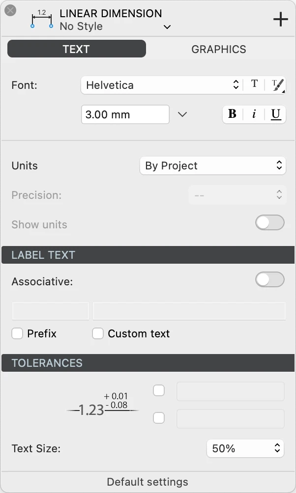
Use this panel to set and edit the parameters of dimension objects. The Dimension tool settings window is includes two panels, Text and Graphics.
Dimension Text Settings
This panel contains all the settings that control the text label that displays the dimension value. You can set the font style, choose the measurement units, add a prefix and enter a custom text, and specify any tolerances.
 _
_
Text Font and Units
- Text font: use the menus and buttons to choose the desired font face, text size (at 1:1), and apply a character style. In HighDesign Pro you can also choose a text Style from one of the resource libraries.
- Units: you can have the dimension value expressed in the current sheet’s units, or specify a custom unit and precision. You can also choose to show or hide the unit symbol.
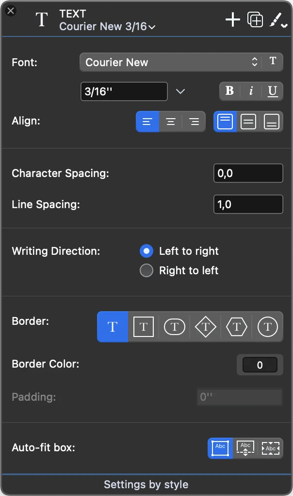
Label Text
Use this section to enable the associative dimension and to enter a prefix and a custom text.
- Associative dimensions are associated to the object they measure and adjust to its geometric changes so that the dimension is up to date all the time.
- Prefix: enable the option and enter a text to be displayed before the dimension value.
- Custom text: enable this option to replace the dimension value with a text.
Tolerances
A dimension label can show tolerance values that define a range within which the measurement is considered valid. This is commonly used when dimensioning parts and components that require particular precision so that the manufacturing machines can be calibrated.
You can choose to enable only the upper tolerance, the lower tolerance, or both. Enter exactly the text that you want to be displayed, for example “+ 0.01” or “- 0.02”.
Tolerances can be displayed with a smaller font size than the dimension label. Use the popup menu to select a value relative to the current font size. For example, if the label font size is 16 points, a value of 75% means that the tolerances will be displayed at 12 points, a value of 50% means 8 points.
Dimension Graphics
Use this panel to define the arrow shape and size, the type of extension lines, gaps, and more.
Arrows
Open the pop-up menu to select an arrow or marker type.
The available types for linear, radial and angular dimensions are:
- None
- 15° arrows in the open, outline, filled and filled with extension variations
- 22° arrows
- 30° arrows
- 45° arrows
- architectural tick markers
- outline and filled circle
- outline and filled square
- outline and filled diamond
- half arrows
The marker types for elevation dimensions are:
Use the text field to specify the arrow or marker size in the current units at 1:1.
Label
Select the position of the text label relative to the dimension line. Choose above, middle or below the line. Positions above and below the dimension line also allow to specify a gap between the line and the text.
A fourth label position locks the label in the most readable position and orientation, that is above and to the left of the dimension line.
Labels can optionally have a border around the text to improve their visibility.
You can select a label orientation from the available options:
- Aligned, readable. A label will have the same angle as the dimension line and will always be readable, even when the dimension line has been rotated or flipped.
- Aligned: the label follows the angle of the dimension line.
- Horizontal: the label is always displayed horizontal even in aligned dimension lines.
Another option let you flip the text relative to the direction of the source points.
Elevation Dimensions
This method can be used to add elevation dimensions to your project.
To create elevation dimensions, set the “zero” datum, that is the Absolute Origin, and click on the points you need to measure. All dimensions will display values relative to the origin; if you move the origin, all other dimensions will change their values accordingly.
Linear Dimensions
This method is used to insert linear dimensions between two points. The dimension line can have a generic angle or can be axis-aligned and display the dx or dy distance with absolute values.
_
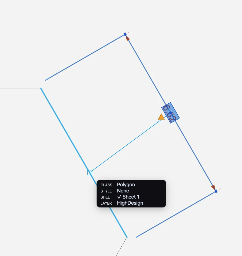
Linear dimensions can be independent or associative (SE/Pro). Independent dimensions are defined by the two source points. Modifying the measured object does not affect the geometry and value of the dimension. Associative dimensions are linked to their source element and update their geometry and value automatically as the source object is moved or modified. Dimension and object can reside on different layers.
Create a non-associative dimension
- Click on the source points and move the pointer to place the dimension line.
- If you move vertically or horizontally (following the guide lines that appear on screen) you create a vertical or horizontal dimension; otherwise, the dimension will be object-aligned.
Create an associative dimension
- Activate the Associative option, either in the Settings window or by clicking the Associative Dimensions button on the Properties toolbar, next to the Dimension methods.
- Click the source object. Associative dimensions must be defined by clicking between two vertex points since they require only the definition of the source object.
- Define the height of the witness line, i.e. its distance from the source object.
Associative dimensions are marked with squares on the source points. These squares are only visible on screen and are not printed nor exported.
_
Associate a Dimension
An independent dimension can be changed into an associative dimension, and vice-versa. To change the associative behavior of a dimension, select it and press the Associative switch on the Dimension Settings.
 _
_
When an independent dimension becomes associative, it lacks the link to an actual source object. Also, deleting or otherwise removing the source object can cause the relative dimension to lose its link. When an associative dimension does not have its source object, or is not able to find it, the square marks are no longer visible and a yellow “caution” triangle appears near the mid point of the witness line. An unlinked dimension can be re-associated to its source object or a new element in two ways:
- Using the command Tools ▸ Associate Dimensions/Annotations. Either select the dimension to link and begin the command, or begin the command and the click on the dimensions. With this method, it is possible to associate more dimensions in one run of the command. When you click on the dimension, a line is drawn from the mid point of the dimension to the cursor. Click on the new source object or element to link the dimension.
- Using the caution triangle. Select the dimension and click the yellow triangle of an unlinked dimension to begin the Associate Dimension command. The procedure is then the same as described above.
Multiple Linear Dimensions
This method allows you to create horizontal or vertical aligned dimensions (dx or dy distances) of two or more progressive points. Once the first segment is defined, all following dimensions will keep the first alignment and height.
Multiple linear dimensions can be of two types: continued and baseline.
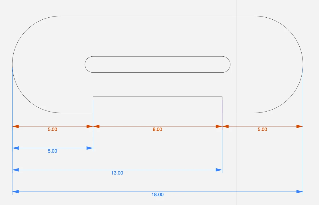
Continued dimensions
Continued dimensions measure points in a linear progression. Each dimension measures the section from the previous point to the next.
Create continued dimensions
- Activate the Multiple Linear Dimensions tool.
- On the Properties bar, make sure the current mode is set to Continued.
- Click to specify the start point.
- Specify the end point. Start and end points do not need to be aligned.
- Define the first dimension line, either aligned to the source points, horizontal, or vertical. The first dimension line defines alignment and height of the successive dimensions.
- Click to specify the next end point. Each new dimension uses the end point of the previous dimension as start point.
- Double click or cancel to end the operation.
Baseline dimensions
Baseline dimensions measure progressive distances from a base point. Each dimension line is placed at an increasing offset from the source points and measures the total distance of the end point from the global start point.
Create baseline dimensions
- Activate the Multiple Linear Dimensions tool.
- On the Properties bar, select the mode to Baseline.
- Click to specify the base point and define the first dimension line.
- Click to specify the next end points. Each new dimension is placed at an offset from the measured objects that is a multiple of the height of the first dimension.
- Double click or cancel to end the operation.
Ordinate Dimensions
With this method you can calculate the perpendicular distance from an origin point. The origin is identified with the Absolute Origin of axes. Distances along the x- and y-axes to objects to measure are specified using extension lines, with the distances indicated numerically at their ends with text labels.
 _
_
Set the Origin and click on the points to measure: move the pointer parallel to the X axis to get the Y distance and parallel to the Y to get the X distance. If you change the origin, Ordinate dimensions will be updated automatically.
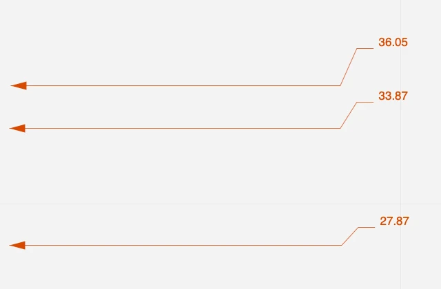
Radial Dimensions
Radial dimensions measure the radius, diameter, internal angle and length of arcs and circles.
_
To create a radial dimension
- Select the Radial dimension tool. If you want the dimension to be associated to the measured arc or circle so that it is always updated, make sure the Associative option is set.
- Click on a circle or arc
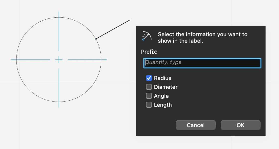
- Move the pointer inside or outside the arc or circle to define the position of the dimension
- As you click, a pop-up dialog lets you choose the type of information that you want the radial dimension to display. The available options are:- 5. Prefix: enter any text that you want to display before the values6. Radius of the circle7. Diameter of the circle8. Angle of the arc9. Length of the arc or circumference of the circle
 _
_
To edit a radial dimension
Select the radial dimension, then
- Click its start point on the circle to move it along the circle
- Click the end point to adjust its orientation
- Click the label to open the pop-up dialog and edit the displayed information
By default, associated radial dimensions show center marks or lines on measured arcs. To hide the center lines, uncheck the Show center marks on the Dimensions settings window when the radial dimension object is selected.
Texts
Topics in this section
Subsections of Texts
About Texts and Labels
Use the Text tool to add styled text blocks and labels to your project. With the text tool you can create multi-line text blocks with different internal font styles and colors, use alignments, and apply border shapes to create a variety of notes, labels, title block paragraphs.
The Text tool includes two methods, text block and text label. Both methods create a text object.
Text objects can be created on drafting sheets, details and layouts. The text can be inserted directly in HighDesign or pasted from another application.
Text objects are treated like any other drawing item, but their internal drawing scale is always 1:1, so that the font size does not change with the sheet scale.
Topics in this section
- Text tool settings
- Insert Text Blocks
- Place Text Labels
- Editing Text Blocks
Editing Text Blocks
Text blocks are rectangular objects that can be moved, resized and rotated. To edit a text block, select the object, then:
- Click the center to move it.
- Click one of the corners to resize the box, and hold the Shift key to resize it proportionally.
- Click on the middle point of one of the sides to resize the box in that direction.
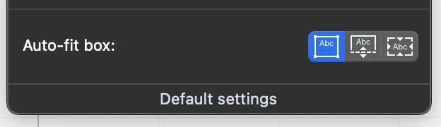
Resizing and the Fit Box Modes
A text block can be freely resized in all directions only when its fit-box mode is set to “fixed-size box”. In this mode, the text block keeps the width and height that you define.
When the fit-box mode is set to “fit height”, you can only resize it horizontally, that is in the direction of the lines of text, so as to enlarge the available line width.
When the fit-box mode is set to “fit-contents”, the text block cannot be resized because its size is calculated on the current text.
 _
_
Insert Text Blocks
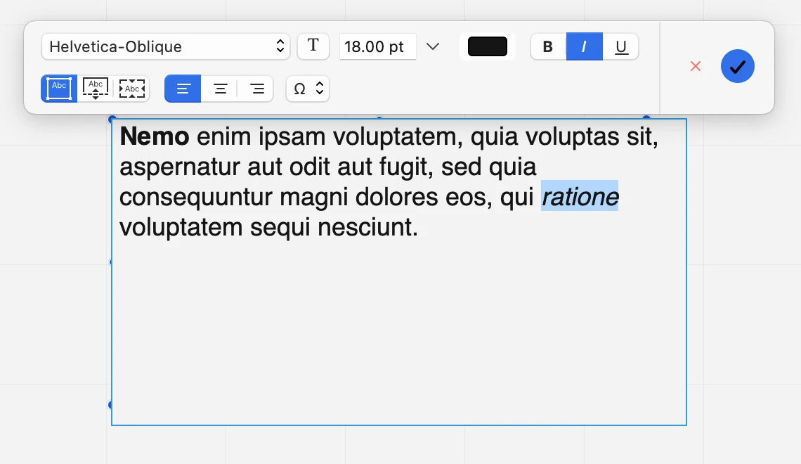
Use the Text Block method to insert multi-line text paragraphs with text styles.
Click to set the base point, drag the pointer to set the width and height of the text field, exactly as drawing a rectangle, and insert the text in the input box; this box also supports the “Cut, Copy, Paste and Select All” commands.
When you define the block, a toolbar opens to let you define character styles.
 _
_
- To apply a style to a character or one or more words, select them in the text input area and choose the desired option on the toolbar.
- Box fit style and horizontal alignments apply to the entire block
- Use the Special Characters menu to insert special characters into the text
- To confirm the text and end the insertion, click outside the text box field, or push the OK button on the Text Style toolbar, or push the Enter key on an extended keyboard.
Place Text Labels
Use this method to place text labels on the drawing without having to define a box or character styles. When you create a text label, the text style toolbar is not available.
After entering the text, you can define a rotation angle for the text.
Steps
- Click to define the insertion point of the text, that is the bottom left corner of the label.
- Enter the text.- 3. Press Return to add a new line of text and create a multi-line label, or 4. Click outside or press the Enter key to end the text insertion.
- Define the angle by moving the pointer. Click to complete the insertion.
To add the label directly without defining the rotation, hold the Command key (Mac) or Control key (Windows) and click outside or press the Enter key.
Text Tool Settings
Use the Text settings window to set and edit the parameters of the text object. This panel includes five sections: font style and alignments, spacings, writing direction, border and box behavior.
 _
_
Font Style and Alignments
Use this section to define the default font properties and horizontal and vertical alignments of the text inside the block. You can select the following properties:
- Font face, selectable from the list of font families installed in your system. You can also access the Font Panel to select a different typeface (only supported for the entire text object).
- Text size, in any supported measurement unit; open the pop-down menu to select a different unit.
- Text style (bold, italic and underline) of the entire block.
- Alignment (left, centered, right; top, middle, bottom), in both multiline texts and single line labels.
Some values such as font style and size can be overridden by character styles.
Spacings
Use these fields to specify character and line spacing.
- Character spacing is the distance in points between each character. You can enter positive values, to create extended text styles, or negative value to create a condensed text style.
- Line spacing is the distance between lines of text. The default value is 1.0, which means that each line is rendered exactly under the previous line with no offset. Positive values increase the distance and negative values reduce it.
Writing Direction
You can specify if the text lines are entered and rendered from left to right, or right to left.
Border
Text blocks can optionally display a border around the text. The available shapes are:
- None. The text block shows no border.
- Rectangle
- Oval, or “pill” shape
- Diamond
- Hexagon
- Circle
You can also specify a border color and a padding, that is the distance of the text from the border.
Auto-fit box
Auto-fit box options: fixed size, flexible height, fit-text. When flexible height is active, the height of the box adjusts to the number of lines of text.
NOTE To set the color of the entire text box, use the colors menu on the Properties Bar.
Annotations and Tags
Subsections of Annotations and Tags
About Annotations and Tags
Use annotations and tags to add text notes that contain information about your project elements. The displayed information can be a custom text, such as material, manufacturing notes, revision comments, or can be derived from the object, such as type, wall width, door height, etc.
The Annotations tool includes two methods that create slightly different annotation objects:
- Annotation, used to add text notes with a leader line.
- Tags, used to mark building element and display instance ID or type ID.
 _
_
Topics in this section
- Annotation tool settings
- Annotations
- Tags
Annotation Tool Settings
Use the annotation tool settings window to set and edit the parameters of annotation and tag objects. The settings window includes sections to adjust the font style and horizontal alignment, the associative mode, leader line style and frame style.
_
Annotation Font Style
Use this section to set the font face, size and style of the text label. You can use the system font panel to select the properties and you can apply a predefined text style selected from those available in the resource libraries.
Associative
Annotations can be associative: enable this option to link the annotation to a reference object.
Leader style
Text annotations can have various leader line styles:
- None: the text note has no line attached.
- Straight line
- Spline
- Arc
Use the Label rotation field to control the rotation angle of the label. When you change the label rotation value, only the text label rotates.
Frame
The annotation label can be displayed with a frame around the text. You can chose one of the following shapes:
- None
- Rectangle
- Oval
- Triangle
- Diamond
- Hexagon
- Circle
The size of the frame can be automatically calculated on the text, or defined manually.
You can also define a frame padding value, that is the distance between the frame and the text, and a frame color.
Tag Settings
Tag settings allow more control on the label contents, orientation and frame style.
_
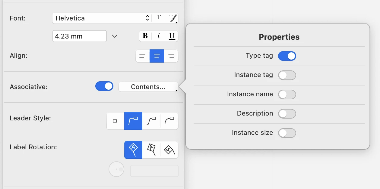
Label contents
Press the Contents button top open a pop-up dialog and choose the properties to display in the tag.
 _
_
Tag Label Rotation
Tag labels can be displayed vertical, aligned to the leader line, or with a custom angle.
Tag Frame Style
The frame of tags can be set automatically by the class of object the tag is attached to, or custom. The shapes used by automatic tags are those defined by the international standards:
- Wall: diamond
- Column: circle
- Window: hexagon
- Door: oval
- other: no frame
Annotations
Use this tool to add text notes with leader lines and arrowheads and tags. The text can be multiline and rotated, but only have one style of font, size and color.
Methods
Leaders can be linear, circular, curved, or invisible. The construction process is similar for all types of leader: the first click defines the start arrow of the annotation and the second click sets the endpoint and the angle; the movement of the pointer and the next click define the landing. Enter the text in the input field.
- A text annotation can have multiple leader lines. Use the corresponding methods to add or remove a leader line from a text note.
Add Leader
Leaders can be added starting from the annotation going to the arrow point, or in the reverse direction, from the arrow point to the annotation. To add a leader:
- Activate the Add Leader method, click the unselected annotation and define the arrow point. The new leader is constructed from the node point.
Alternatively:
- Activate the Add Leader method, define the arrow point anywhere on the drawing and click the annotation.
Remove Leader
To remove a leader from an annotation, activate the Remove Leader method and click the leader line to remove.It is possible to remove all the leaders of an annotation, leaving only the text note.
- In HighDesign SE/Pro, annotations can be associative so that their position is determined by the parent element. Moving the parent element also moves the associated annotations.
- When used on a project element, the annotation prompts basic information about that element. Supported object classes are hatches, symbols, walls, columns, doors and windows. For example, annotations added to symbols by default prompt a caption with the names of the symbol and the current view.
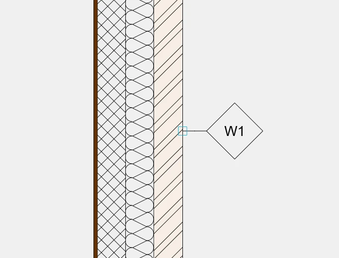
Tags
Tags (Pro) is a method of Annotations. Tags are special annotations that automatically display selected information associated with certain classes of elements:
- Hatches
- Symbols
- Images
- Architectural elements (Walls, Columns, Windows, Doors).
The Contents menu of the Settings window lists all the information that can be displayed in the tag label: select the options you wish to display.
 _
_
The information can be computed or extracted from those added to the corresponding class of elements in the Object Info panel or in the Style/Type Settings window. Only the available information are displayed in the tag label.
Tables
Subsections of Tables
About Tables
Tables contain information and data about the design in rows and columns, and complement the model and the drawings as a documentation functionality. You can insert data directly or import a worksheet from a spreadsheet software, format the data customizing colors, fonts and sizes, and add formulas that perform calculations of sets of cells.
 _
_
Topics in this Section
- Table Tool Settings
- Create a Table
- Import a Worksheet
- Formatting a Table
- Add Functions to a Table
Add Functions to a Table
Table cells can also display text that is the result of a function. To add a function, select a cell and press the Function button on the Table toolbar.
HighDesign includes the following functions:
- Sum
- Product
- Average
- Maximum
- Minimum
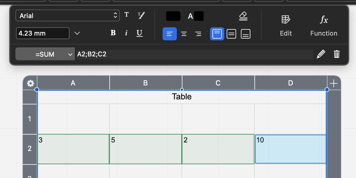
After pressing the Function menu, the toolbar expands to show the Function field and controls. Use the pop-up menu to select a function.
To define the cells that provide the data for the function, click on them or enter their coordinates in the field. Press the checkmark button to confirm the selection.
To edit a function, select it and click the Edit or Pencil button on the toolbar.
To remove a function, select it and click the Delete button on the toolbar.
Create a Table
To create a table:
- Activate the Table tool.
- Click to specify the insertion point.
- Move the pointer and click again to define width and height of the table.
The table is created with the default number of rows and columns as set in the Table Settings panel. The width of columns and the height of rows are calculated from the table width and height.
To select a cell, select the table object, then:
- Click on a cell to select it
- Shift-click on a second cell to select all the cells from the first selected to the second selected.
- Cmd-Click (Mac) or Ctrl-Click (Win) to select a cell without deselecting the others.
- Press the up, right, bottom and left arrow keys on the keyboard to move the selection to the nearest cell in that direction.
- Press the Tab key or Shift-Tab to move the selection to the next or previous cell. When the cell text was edited, the Tab key also confirms the input.
- Press the Return key to edit the selected cell.
- Press the Esc key to cancel the current input, or deselect the cells.
To enter data in the table:
- Select the table.
- Click on a cell to select it and enter the text.
- Press Enter to confirm the text, or Tab to move the focus to the next cell.
You can also double-click a cell to open the input area directly.
Format Table Cells
When you select one or more cells in a table, the Table Formatting toolbar opens on the top side of the drawing area.
Use this toolbar to
- Set the font, size and style of the selected cells. These settings override the default parameters of the table.
- Set the cell background and text colors.
- Change the horizontal and vertical alignment of the text inside the cell.
- Clear all formatting of the selected cells and revert them to the table defaults.
- Edit the table to insert and remove rows and columns, fit row heights and merge or split the selected cells.
- Insert and modify functions and formulas.
Edit the Table Cells
Click the Edit button on the Table toolbar to open the Edit menu. This menu provides the following functions:
- Insert Row Above/Below: adds an empty row above the first selected cell or below the last selected cell.
- Insert Column Left/Right: adds an empty column to the left of the first selected cell or to the right of the last selected cell.
- Delete Row/Column: removes the row or column of the selected cells.
- Fit Row Height: resizes the row to fit the largest text in all columns.
- Merge Cells: when the table contains two or more selected cell, this command merges the cells from the first to the last cell. The selected cells don’t have to be contiguous. Note that the Merge command only displays the content of the first cell and hides any data that might be in the other cells.
- Split Cells: apply this command to a merged cell to restore the original rows and columns. This command also restores the original data of the other cells.
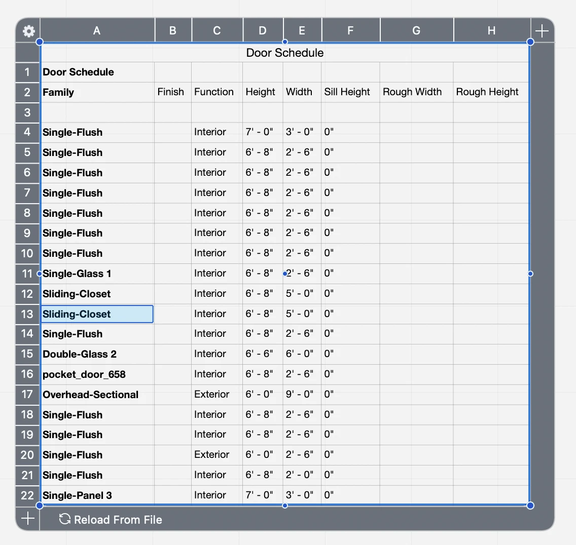
Import a Worksheet
You can import data from another software using the XLSX (Excel worksheet) and .CSV (Comma-Separated-Values).
Insert a Worksheet
- To import data from a worksheet, choose Project ‣ Insert ‣ Table.
- The data will be converted to a HighDesign table. Click on the drawing area to insert it.
The Excel (.xlsx) file format retains formatting and sizes, while CSV is a data-only format. In the latter case, HighDesign creates a table using the current default parameters for row height, column width and text style. Once inserted, the table can be edited and formatted as needed.
 _
_
Data Link
The inserted table keeps a link to the original file whenever possible. That means that you can update the contents of the table in HighDesign at any time when the original file is being edited in another software.
To update the data in a table, select it and press the Reload From File button.
Reloading the data updates the content of the table and adds rows and columns as required by the data, but does not change the current formatting style of the table.
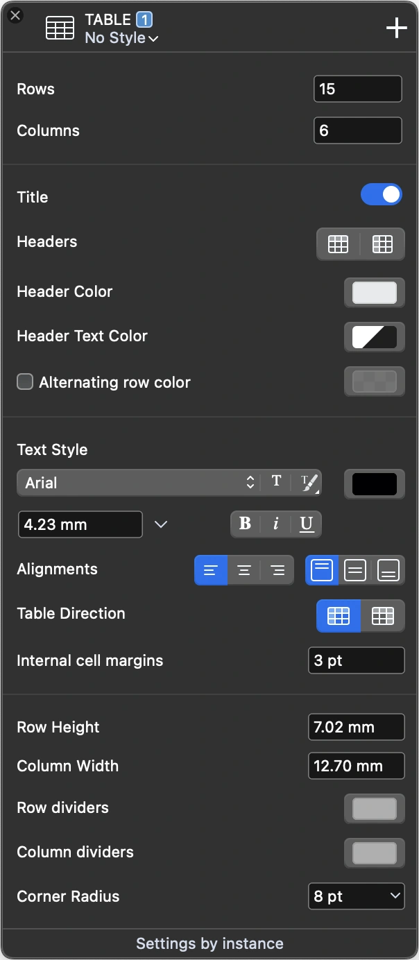
Table Tool Settings
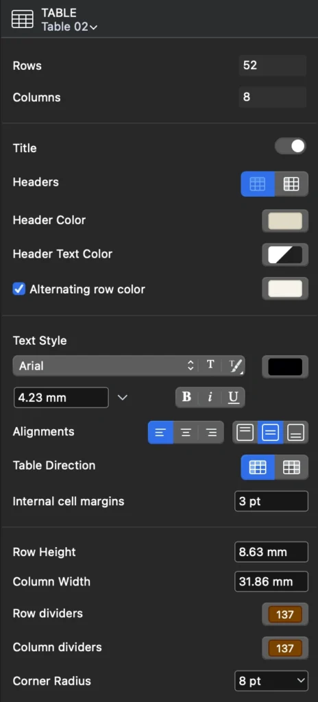
Use the Table tool settings panel to specify the default parameters for new tables or modify a selected table.
The panel includes sections to let you define the number of rows and columns, title and headers, font and text sizes, and row and column sizes.
 _
_
Define Rows and Columns
Use the Rows and Columns fields to define the number of rows and columns in a table. Please note that reducing the number of rows or columns will also discard any content in those cells.
As you increase the number of rows or columns, the table adds the item to the bottom or right and copies its size from the previous row or column in the table.
Title, Headers, Alternating Rows
Activate the Title switch to add a title to the table. The actual title and its formatting can be edited directly on the table like any other cell.
A table can have both a horizontal header for the columns and a vertical header for the rows. When the headers are enabled, the first row after the title and the first column will be displayed as headers.
Use the buttons in this section to specify background and text colors for the headers.
You can also choose to display the data rows with a custom, alternating background color. Activate the Alternating row option to enable this feature. The first row background color is that defined as table background color in the Properties bar or Graphic Attributes panel.
Text Style
Use this section to specify the default font, size, color and style of the entire table, with the exclusion of the title row.
The Alignments buttons let you specify the default horizontal and vertical alignments of the text inside the cell.
You can also change the horizontal direction of the table, left-to-right or right-to-left according to your regional settings.
Use the margins field to change the internal margin of the cell, which is the distance from the cell border to the text.
Row, Column and Border Options
Use this section of the panel to customize the default row height and column width, and change the colors of the horizontal and vertical separators. To hide the separator lines, set the No Color option on the Color pop-up window.
Tables can have a border whose color is defined through the Properties bar or Graphic Attributes panel. To hide the border of a table, set its color to “No Color”.
Table borders can be rounded: use the Corner Radius field to specify a rounding value.
Schedules
Subsections of Schedules
About Schedules
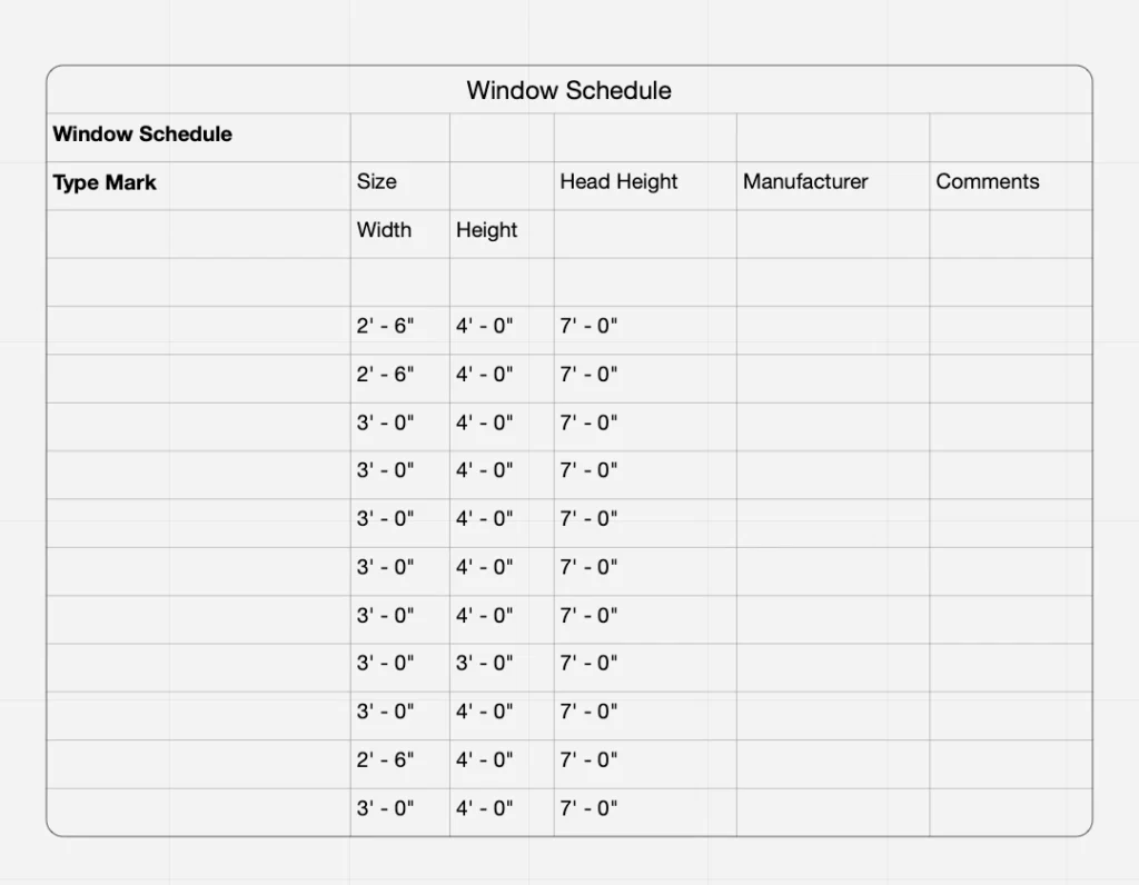
A schedule is a list that displays information about the elements in a project, extracted in real time and organized according to the specified parameters. For example, a schedule can list all the doors in a project organized by type and show their quantities, or list the walls on a specific layer along with their total length, surface and volume.
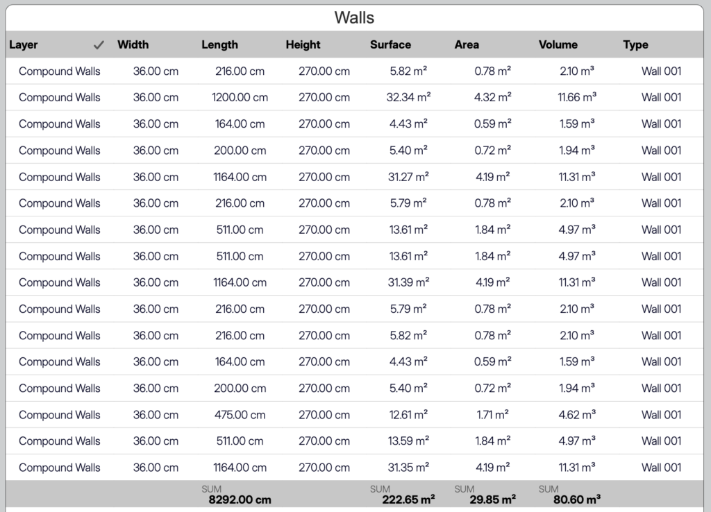
Schedules in HighDesign are interactive: each row in the table corresponds to an actual object in the project. Changes to that object are reflected in the schedule, and, where the parameter allows it, you can actually edit the listed item on the schedule and see the changes applied to the object in real time.
You can control the information shown in the schedule via its Settings panel, where you choose to list specific sheets or the entire project, define which category to list, apply filters, select the fields and define grouping and sorting rules.
Schedules can be formatted mostly like a table. You can change title, headers and data formatting, colors, sizes, and apply a predefined style.
Topics in this section
- Create a schedule
- Applying filters
- Sorting and Grouping
- Show totals, sums, averages, and count
- The Schedule sheet
- The Schedule table
- Formatting a schedule
- Export the schedule
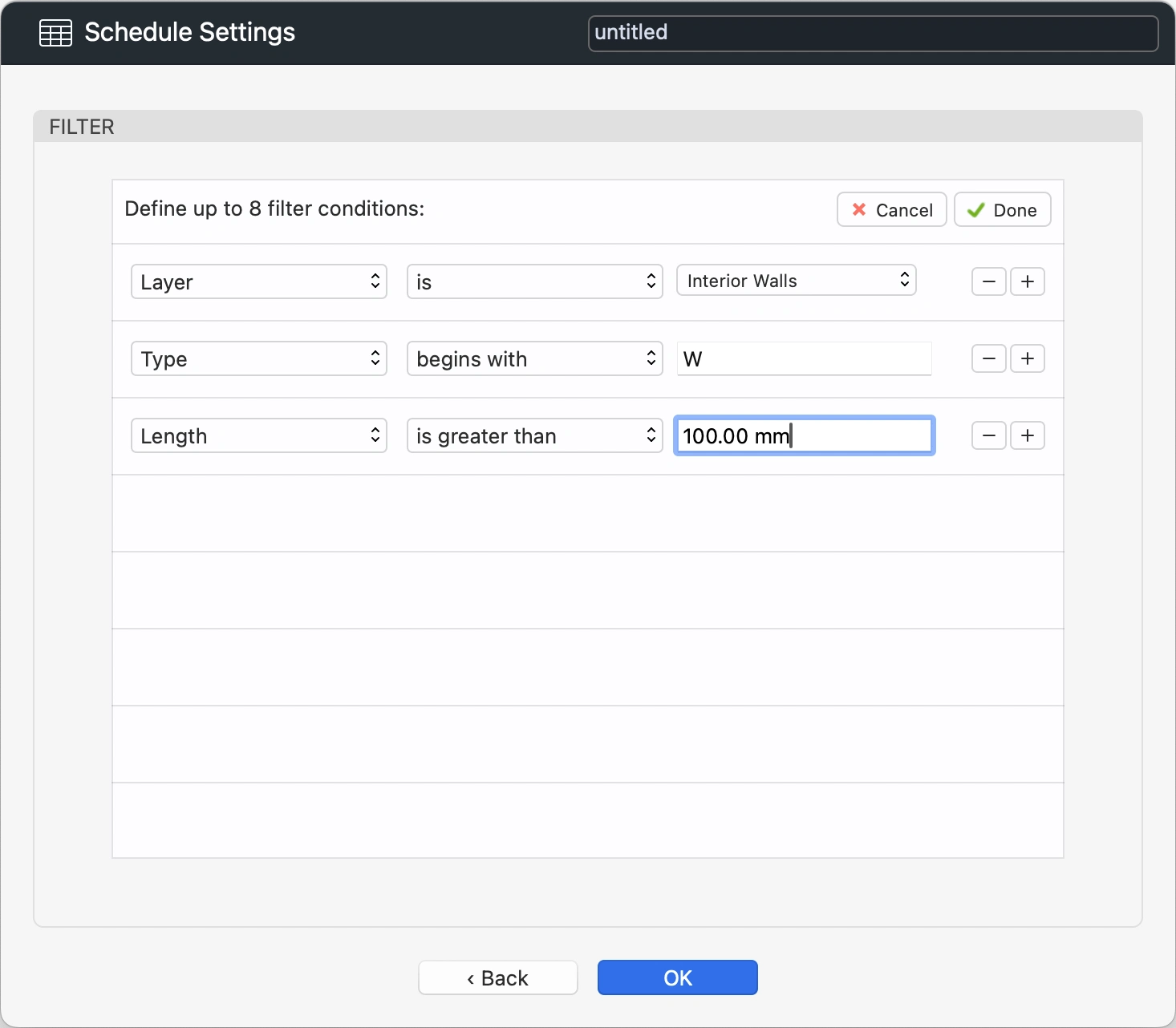
Apply Filters
On the Filter panel of the Schedule Settings dialog, you can define rules that limit the number of listed items in a schedule.
To open the Filter panel, click the Filter button at the bottom of the Category list in the Schedule Settings dialog.
 _
_
You can define up to 8 filters, and all the criteria must be satisfied for the data to display.
A filter is structured as a sentence: the subject must meet a certain condition according to the logical rule specified. The subject is one of the available parameters of the current category, the condition is a number or text that you enter or a value selected from a list, and the rule defines a comparison between the subject and the condition, such as “begins with” or “is greater than”.
To define a filter, do the following:
To add a new rule, click the plus (+) button.
To remove a rule, click the minus (-) button. You can remove rules at any position.
To confirm the filters, click Done.
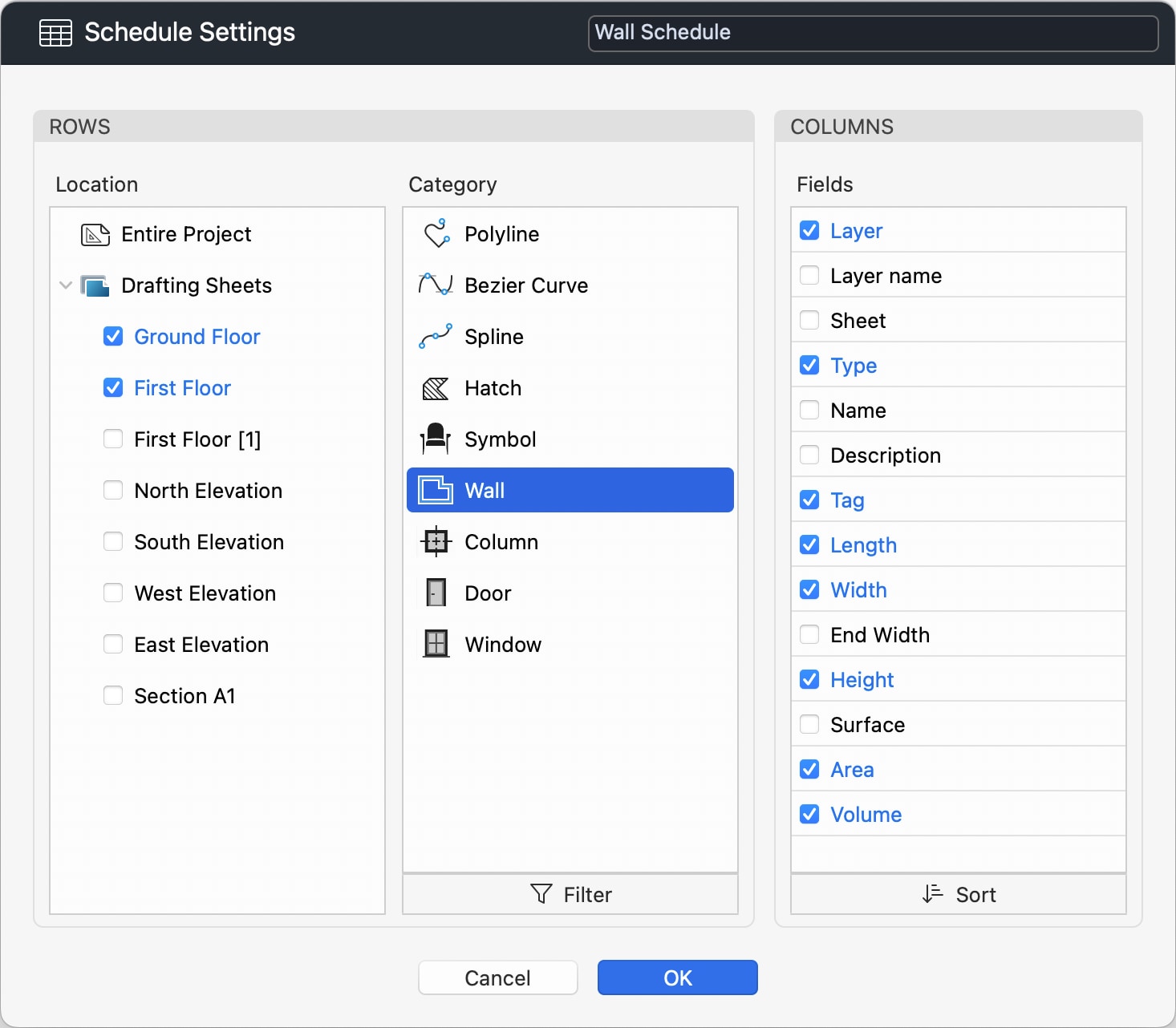
Create a Schedule
How to create a schedule in a project:
- Choose Project ‣ Schedules ‣ New ScheduleAlternatively, click the + button on the Schedules section of the Project Browser.
 _
_
In the Schedule Settings dialog, you can enter a name and define the schema by selecting the category of items that will be listed in the rows of the table, and the fields to show in the columns.
To define the rows, do the following:
To define the columns, do the following:
Click OK to create the schedule.
Editing Schedule Elements
Schedules in HighDesign are interactive, in that each row of the table maintains a link to an actual element of the model so that values and calculations are always up to date. This connection works both ways: as you work on the model, the values on the schedule are updated, and you can also edit values directly on the schedule and see the changes in the model in real time. For example, you can change layer, type or length on the schedule and instantly see the modifications in the project.
Selecting an Element
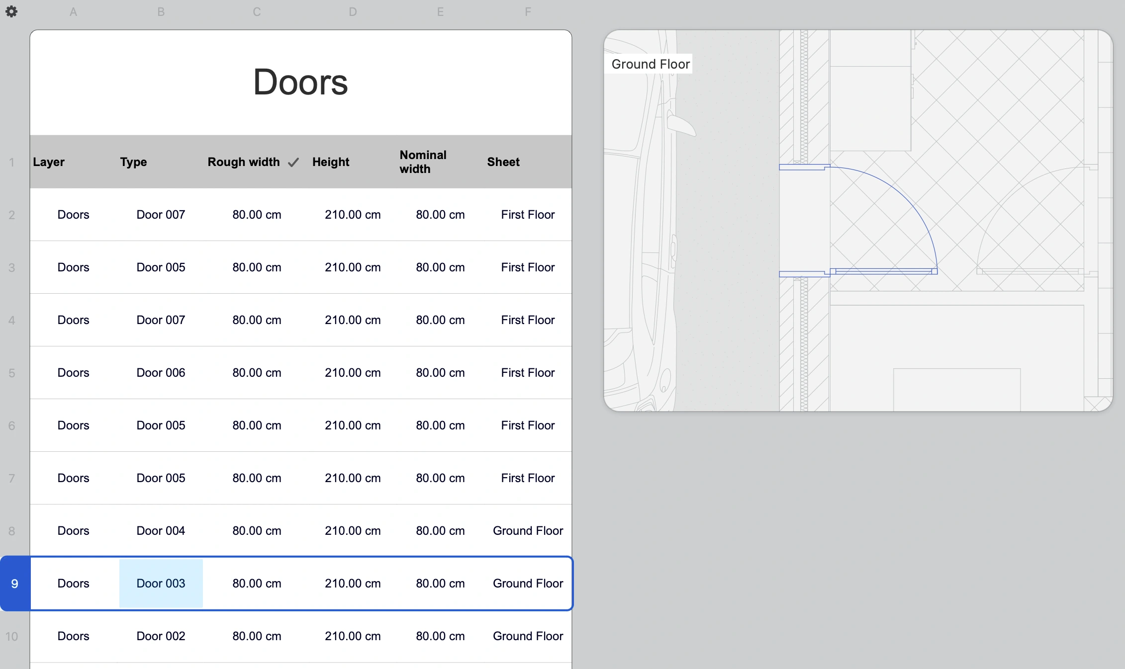
Click the row index to select the linked element on the schedule. A preview box on the right of the table shows the element in its context.
Double click the row index to go to the element’s sheet.
 _
_
Editing an Element
Editable fields in a row are marked with a solid border. Depending on the type of data, you can enter a value, such as a length or height, or choose an item from a list.
Values are entered in the units defined by the schedule sheet. You can change linear and angular units through the Object Info panel or the units popup on the Input bar of the main window.
Any change to an element’s values are applied immediately to the element.
Export a Schedule
Schedules can be exported as Microsoft Excel workbooks (.xlsx) or Comma-Separated-Values (.csv).
To export a schedule, do any of the following:
- Click the pop-up button on title row and choose Export.
- Push the Export floating button on the sheet.
Both file formats are widely supported by various desktop software and mobile or web apps. The conversion to the Excel format attempts to retain as much formatting settings as possible, and further formatting options can be defined in Excel or another software used to open the schedule.
The CSV format is a data-only format that retains no formatting, but is widely supported and easily readable and editable with any text editor.
Copy as CSV
When you select the entire schedule, choose Edit ‣ Copy to copy all the data as CSV text.
Formatting a Schedule
You can specify various options to format the schedule, including colors, fonts and sizes by using the Schedule Table Settings panel.
To open the Schedule Table Settings panel:
- Click the settings icon at the top-left corner of the sheet, between the horizontal and vertical headers.
- Alternatively, open the pop-up menu on the schedule title row and choose Table Settings.
Set a Style
As for other tool settings panels, you can click the title to open the Style chooser and change the style of the entire schedule. The styles are those available to the Table tool as there is no need to have a schedule-specific style. There are several predefined styles in the HighDesign library, and you can create and extend your own library of table styles.
 _
_
Not all parameters are available to schedules. The following fields and buttons are disabled:
- Rows and columns
- Title, always active
- Headers: the header row is always active. The header column can be enabled.
All other parameters can be modified. Text style parameters always affect to the entire table.
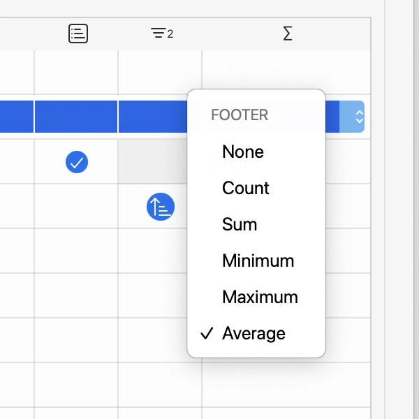
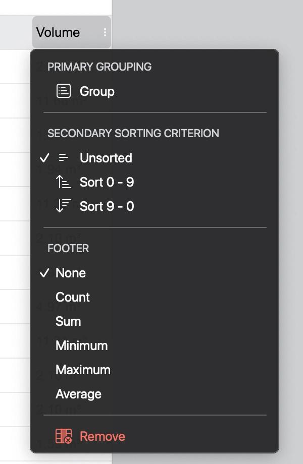
Show totals, sums, and count
Schedules can display sums, totals and calculations. In the Sort panel, you can define what sums and calculations to display in the schedule by using the last column, marked by the Sum symbol.
Click the cell in the last column to define what calculation should be displayed. When you add a sum or total, a footer row is added at the bottom of each group or of the table if no grouping was defined.
Textual and object fields only allow the Count calculation, that is, the number of items. Numeric fields also allow sum, minimum and maximum, and average. These values are calculated in real time and are always up to date.
 _
_
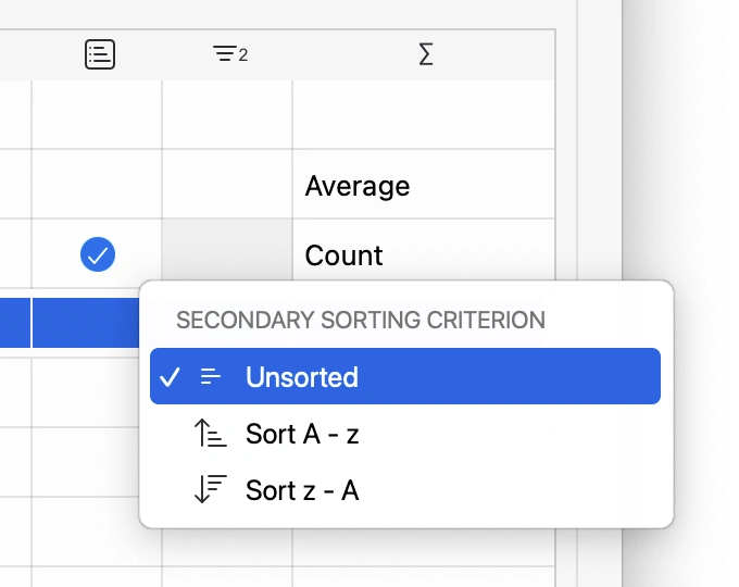
Sorting and Grouping
Use the Sort panel to reorder the columns of the table, to define how the data should be grouped, and to specify what calculation to display in the footer row.
_
Reordering Fields
To reorder the fields, drag a row and move it up or down as desired. The letters refer to the columns as it is customary in all spreadsheet applications: the first column is A, the second B, and so on.
Primary Grouping
You can organize the data in the schedule in groups defined by a field. For example, in a Wall schedule you can group the listed walls by Type so that all the walls of the same type will be listed together. If you used four wall types in your project, the schedule will display four groups.
To select which field defines the primary grouping, click its cell in the second column. The check-mark indicates the current primary grouping field.
Only one primary grouping field can be selected.
Sorting
 _
_
The items in the group can be further organized by selecting a sorting criterion.
You can sort the items from first to last, last to first, or leave them unsorted. In this latter case, the items are listed in the order in which they are in the project.
The Schedule Sheet
Once you create a new schedule, it is placed on a new schedule sheet that is listed on the Project Browser in the Schedules group. The schedule sheet and table provide various options for the quick formatting and editing of the schedule.
On the schedule sheet, you can modify the table structure to resize columns, rows and specify various formatting options for a schedule, such as colors, fonts and sizes.
The schedule sheet also includes two floating buttons to open the Schedule Settings window and to export the schedule as CSV or Excel.
Table Structure
The schedule sheet always shows the horizontal and vertical table headers on the top and left sides of the sheet. These special headers show the structure of the table and the identifiers of the columns (A, B, C…) and rows (1, 2, 3…). Use these headers to select a row or column or to resize them.
Select a Row or Column
Click on the heading to select the entire row or column.
Select All the Table
Choose Edit ▸ Select All to select all the data of the table.
Resize a Row or Column
- Move the pointer over the separator to the right of the column or below the row. The cursor changes to show that a resize action is available.
- Click to initiate the resize action.
- Move to enlarge or reduce the item. Rows and columns can only be resized within certain ranges, from a minimum to a maximum size.
The Schedule Table
The schedule table is the table that displays the actual data of the schedule. This is a special table that provides options that are specific to schedules.
Title Row
A schedule table always shows the title row, it cannot be omitted. Double-click the title row to change the schedule name.
On the right end of the title row, a pop-up button provides access to the Schedule Options menu. Move the pointer over the title row to reveal it and click the button to open the menu. The available options are:
- Settings
- Filters
- Sort
- Export
_
Header
The horizontal header displays the fields in their order and is always visible. The field that controls the primary grouping is marked with a check-mark.
At any time you can click a field to open the Grouping, Sorting and Totals menu. Use this menu to:
- Change the sorting options and define a different primary grouping field.
- Change the sorting order.
- Enable or disable a footer field with totals and calculations.
- Remove the row from the schedule.
 _
_
Layouts
Topics in this section
Subsections of Layouts
About Layouts
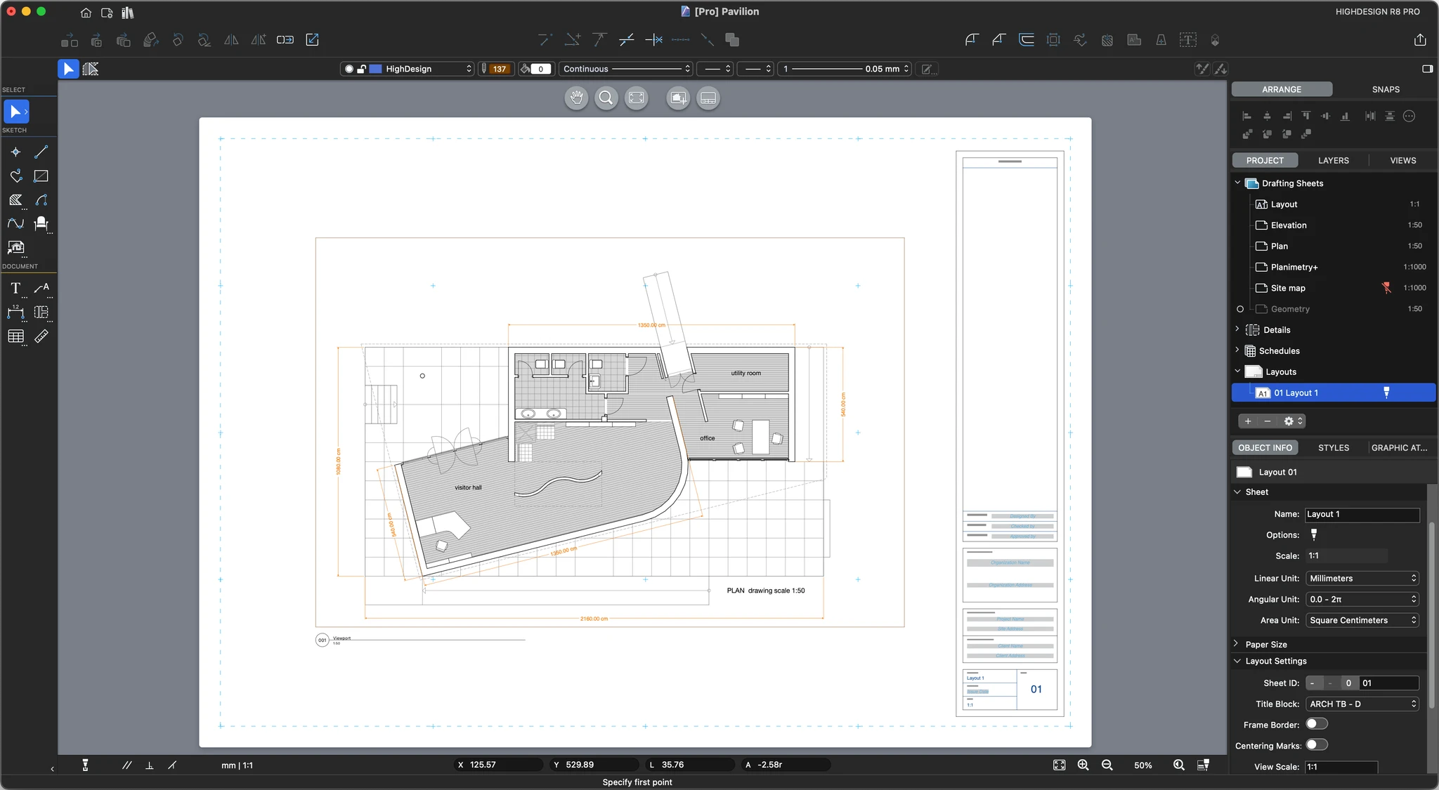
Layouts (Pro) are sheets that are used to present and publish drawings arranged in boxes called “viewports”, with optional, additional information contained in title blocks and text notes. Layouts are not intended to host their own drawings, although you can use some of the drawing tools, but rather as containers of drawings extracted from the other sheets.
Use layout sheets to display and arrange scaled views of your project on a standard-size sheet. Layouts can show a pre-made title block with global information about your firm, the current project, and sheet-specific information.
These sheets are intended for publishing and output purposes, therefore layouts have some characteristics that are unique:
- Layouts are opaque sheets
- The scale of the layout is always 1:1 real scale
- Layouts have a paper size, defined as default by the Paper Format settings of the project
- By default, the origin of the layout is located at the origin of the margins, so that changing the margins does not affect the relative position of the drawings
- You can choose to show the current print margins
- Layouts always have a sheet ID
- You can add a Title Block by choosing from the existing ones or you can create a new one
- There are the options to show the frame border and the centering marks
- You can set the nominal scale of the views
- You can enter text information to the current layout to be shown on the title block
- You can create one or more viewports to show and arrange selected views of the project at the desired scale
- The available set of drawing tools is limited to sketching and documentation tools
Create and Edit a Title Block
Creating a new Title Block
You can create a new Title Block through the Title Block menu on the Object Info panel of the current Layout or through the menu Project ▸ Title Block. Title blocks are designed in a specific workspace that provides the graphic tools required to draw the title block and a panel to set the title block name and manage the text attributes.
- On a layout sheet, choose Project ▸ Title Block ▸ New Title Block.
- The first dialog asks you to choose a reference paper size for the new title block. Although a smaller title block can be used on larger paper sizes, it is best to select the ideal paper size this title block is intended for.
_
_
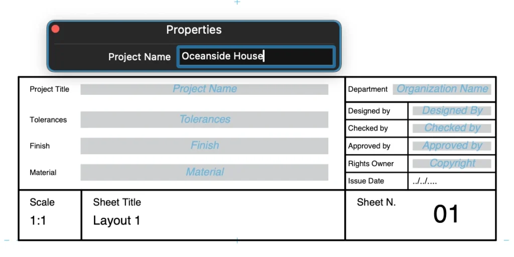
Attributes are text values with dynamic content. The pre-defined attributes can be selected through the menu on the Title Block panel. These attributes are separate as:
- Layout attributes which correspond to the information entered in the Layout Settings and Info sections of the Object Info panel of the current Layout;
- Project attributes corresponding to the information entered in the Project Information panel of the Project Settings window.
Attributes of the title block can also be custom attributes and once you click the Add button, the Define Attribute window opens displaying the options and input fields.
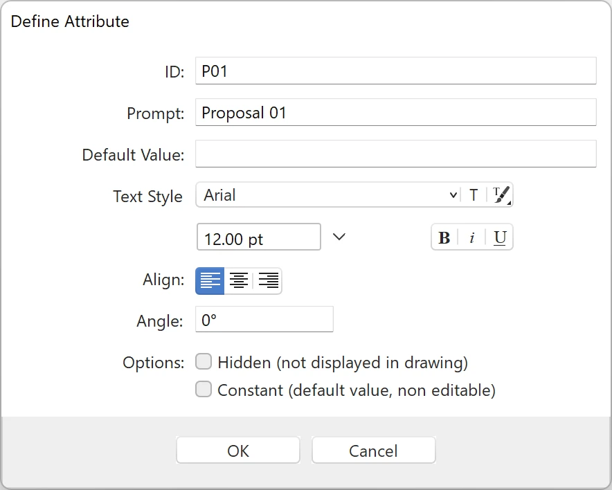 _
_
Inserting a Title Block Attribute
To insert an attribute on the title block, click on the desired location. Attributes are special text objects and can be moved or aligned. You can modify the text properties through the Text settings panel (double-click the Text tool on the toolbox to open it). To change its Attribute properties, press the Edit Attribute button of the Title Block panel.
The Save button creates a new Title Block on the User Library which is immediately available for use in the current layout and in new projects.
A Title Block can be inserted even in a layout of different size from the one it was created for, depending on its bounds. When you select a title block it is automatically inserted at its default position on the layout as a preset: anyway, you can move it to any other position as a drawing object.
Inserting a Viewport
You can insert the viewport on the layout as an object of predefined size or you can draw the viewport as a rectangle by its diagonal, depending on the selected size option.
To insert a new viewport
- You can insert a new viewport in two ways:
_
The center of a new viewport corresponds to the center of the selected source drawing: if you wish to display a specific area of the drawing, select the viewport, click inside and move the source drawing within the viewport till the desired area matches the center of the rectangle.
A viewport can be moved within the layout as a drawing object with its properties: frame and background can have their color and line style.
Viewports created as rectangles can be resized by their selection handles, either vertices or midpoints, or through the Object Info fields of Viewport Geometry. Viewports created by the extents of the source drawing cannot be resized.
 _
_
The information displayed in the title mark of the viewport can be quickly set and edited through the ID section of the Object Info panel which provides the Id and Name fields and the button to open the Viewport settings dialog.
For a quick access to the source sheet of the selected viewport, click the link icon on the upper left corner of the viewport.
Layout Settings
Use the Project Browser panel to create, activate, rename and reorder your project Layouts.
To set the parameters of the current layout sheet, use the Object Info panel. The Layout info panel shows all the options, settings and information of the current layout and is divided into four sections:
- Sheet, which displays name and generic sheet information like scale and units;
- Paper Size, to change the size of the current Layout only;
- Layout Settings, to set sheet ID, title block and nominal View Scale;
- Layout Info, to set the issue date and enter text information.
_
Sheet options
Use this section to enter the layout name and disable snaps.
The sheet scale is always 1:1 and cannot be modified.
You can set linear, angular and area units.
_
Paper options
Expand this section to change the paper size and margins.
As for drafting sheets, you can select the paper standard, size, and orientation, and choose to show or hide the print margins.
_
Layout Settings
Use the Layout Settings section to define the sheet ID, add or remove a title block, and define various settings about views and grids.
- Sheet ID: this is the identification code of the sheet. It follows a schema made of “Discipline” - “Optional Sub-Discipline” - Number. Disciplines are identified by a letter, such as “A” for architecture, “C” for civil", etc. HighDesign includes a default list of the most common disciplines.
- Title Block: use this menu to manage the sheet’s title block. You can choose any title block that is available in the resource libraries, even if it was not designed for the current paper size. You can read more on title blocks on the Title Blocks page.
- Frame Border: display or hide the frame border of the layout.
- Centering marks: show or hide marks drawn on the frame border that help with the positioning of the drawings.
- View scale: this is an information about the nominal scale of the drawings contained in the layout and can be displayed in the title block. It does not affect the scale of the layout sheet.
- Show Grid and Grid partitions: show or hide a non-printable grid that helps with the positioning of the drawings on the page.
_
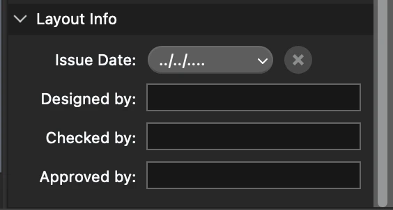
Layout Info
Use this section to add and edit information about this layout that can be displayed on the title block. You can enter:
- Issue date of this layout
- Designed by: the name of the person who designed this layout
- Checked by: the name of the person who checked this layout for errors
- Approved by: the name of the person responsible for approving the layout.
 _
_
Title Blocks
A title block is an element of a layout that contains information about the design firm, the client and site location, the project and the sheet. It usually has a border and is organized in sections with different types of data and is usually found on the bottom or lower right-hand corner of any layout sheet.
A title block is a sub-class of the Symbol and inherits all the properties of symbols. The information displayed on a title block can be entered as attributes that are defined when the title block is designed. In addition to attributes, title blocks can contain text labels and blocks with custom or automatic content.
Insert a Title Block in a Layout
When the current sheet is a layout, you can insert a title block using the Title Block pop-up menu, which can be accessed in two ways:
- On the Object Info panel, go to the Layout Settings section and open the Title Block menu.
- Using the floating buttons on the layout sheet, press the Title Block button.
_
The title block menu includes the following options:
- New title block button.
- Edit title block.
- Duplicate.
- Remove title block.
- List of the title blocks available in the libraries and used in the project.
To insert a title block into the current layout, choose a title block from the libraries. The title block is inserted at its default location on the layout.
Since title blocks are usually created for a specific paper size, make sure the selected title block fits the paper. Depending on the disposition of its elements, you can resize the title block as you need.
Remove a title block
If you want to completely remove a title block from the current layout, press the Remove Layout button on the Title Blocks menu.
Create, edit and duplicate a title block
Use the buttons on the Title Block menu to create a new title block, edit or duplicate the current title block.
Edit the Attribute Fields
A title block may contain three types of elements:
- Graphics and static texts. These are the usually the borders, separators and section and field titles. These elements can be modified in shape and graphic properties by editing the title block.
- Sheet and project attributes. These attributes extract their value directly from the information set in the Sheet Info, Layout Settings and Layout Information sections in the Object Info panel, or from the Project Information panel of the Project Settings window.
- Editable attributes. These fields show custom information entered by the user.
To enter the values in editable attributes, select the Arrow tool, double click the attribute field in the title block, and enter the value in the popup window.
 _
_
Viewport Settings
Open the Viewport settings panel by pressing the Settings button on the Properties bar or on the Object Info panel.
The Viewport settings window contains two panels with Drawing and Title Mark options.
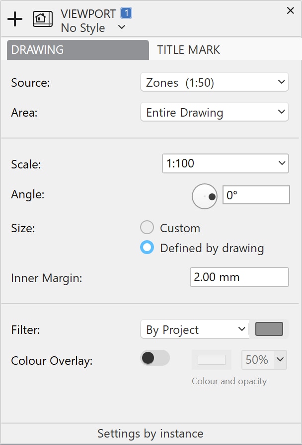
Drawing
The Drawing panel provides the options of viewport window and selected view:
- Source drawing: select the sheet from where the drawing is taken. You can select drafting sheets, detail areas or details of the project.
- Area: select “entire drawing” to use the entire contents of the sheet as source, or select any detail areas on the sheet to restrict the source area.
- Scale of the view, which can be different from the original scale of the selected sheet.
- Angle of the view. Rotate the view by using the angular slider or by entering the value in the field.
- Size of the Viewport: the window can have a custom size, defined by you, or it can automatically fit the extents of the source drawing. Automatic-sized viewports cannot be resized manually. Choose custom to manually resize the viewport box.
- When the size is defined by the source drawing, you can also specify an inner margin between the drawing and the viewport border. The inner margin value is expressed in the base linear units (mm, inches, or points) and at a 1:1 scale.
- Filter applied to the view (by project, by layer, black and white, grayscale, etc.). The filters menu also allows you to hide in the viewport texts and annotations that are on the source sheet.
- Color Overlay: you can add a color fill with adjustable opacity that is displayed over the drawing.
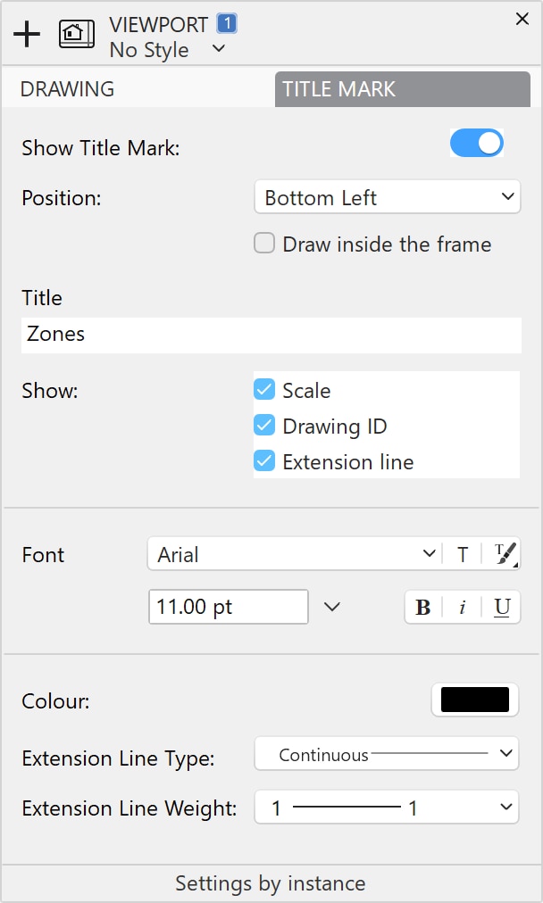
Title Mark
On the Title Mark pane you can set the position of the title mark within the viewport, the name of the view, the option to show scale and other graphic options.
The available options are:
- Show/Hide Title Mark;
- Position of Title Mark within the viewport on the upper or bottom edge;
- Title of the Viewport;
- Font options - font menu, button to open the Fonts window, button to select existing styles, font size and units menu, default text styles;
- Show/Hide Scale of the view;
- Show/Hide Extension Lines of the Title Mark;
- Extension Line options.
Viewports
Viewports are elements that display scaled views of the project. Think of them as windows that show a portion or the entire view of a drafting or detail sheet, and provide basic information about the views. When you use layouts and viewports, the drafting sheets and the other design sheets contain your project, whereas layouts and viewports show a clean view of the project suitable for presentation and revision.
- It is also possible to use only the drafting sheets to present your project, since drafting sheets can have their own drawing scale and paper size. This workflow offers of the advantage of directness because what you see on the drafting sheet is exactly what you will see on the printed sheet, but it lacks the flexibility and scalability of layouts and viewports.
Viewports exist only on layout sheet. On each layout you can place one or more viewports that reference different drafting sheets, parts of the same sheet or event the same view at different scales. The view displayed in a viewport can use a custom rotation angle, a filter that changes the way borders and fills are represented and a transparent color overlay.
_
To create a new Viewport use the button on the top-left corner of the Layout canvas or select the menu command Project ‣ Create Viewport. Viewports exist within Layouts only.
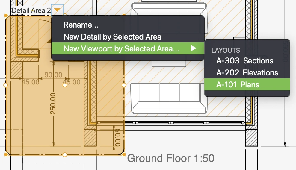
The Viewport tool lets you create a viewport directly by a detail area too: select the source sheet and then choose a detail area. Position and size of the viewport will be taken from the source area and updated live if the detail area is modified.
Alternatively, viewports can be created directly from a detail area. On a drafting sheet, select or create a detail area around the part of the drawing that you want to show in the viewport. Click the pop-up arrow near the detail area name, go to New Viewport by Selected Area and choose the layout on which to create the viewport.
 _
_